Royal Oak Chronograph
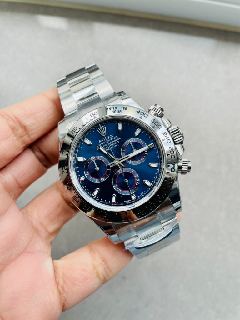
Rolex Daytona 116509 (BTF 1:1 Best Edition) Blue Dial on Stainless Steel Bracelet – SA4130 V2 Super Clone
40 mm
Stainless Steel
RLX-116509-38974
Call: +1 (800) 729-2661
sales@replicawatchesco.com
Audemars Piguet watches are easy to recognize and surprisingly easy to get wrong.
The octagonal bezel gets most of the attention, but it rarely settles the comparison by itself. On a Royal Oak, the bracelet begins almost as soon as the case ends. The first links, bezel, mid-case, dial, and clasp all contribute to one continuous shape.
That makes Audemars Piguet replica watches different from watches where the bracelet feels like a separate component. An AP replica can have a convincing dial and clean bezel screws, then look awkward because the first bracelet links leave the case at the wrong angle. Another can have the right dimensions on paper but wear too thick because the caseback and mid-case don’t follow the proportions of the reference.
For ReplicaWatchesCo.com, the comparison starts with the complete watch, not a factory name or one close-up of the dial. Look from bezel to clasp.
The Royal Oak gives you very few soft visual breaks. The bezel meets the case. The case flows into the bracelet. The bracelet tapers toward the clasp, while brushed surfaces meet polished bevels across nearly every part of the watch.
When those transitions work, the watch looks cohesive. When they don’t, it looks assembled from several decent parts that were never properly brought together.
So a front-facing product photograph only gets you started. Turn the watch at an angle. Study the first bracelet links, the side of the bezel, and the case flank. The design gives you plenty of straight lines and hard edges to compare, and small proportional errors tend to travel across the whole watch instead of staying in one isolated spot.
The Royal Oak family covers different sizes, generations, movements, dial layouts, and case profiles. A 15400 shouldn’t automatically be compared with a 15500, and the 15510 changes the details again. A thin 15202-style watch has a very different proportion problem from a thicker automatic Royal Oak.
Start with the reference family, then identify the full configuration:
Only after that does it make sense to compare factories and batches. The wrong reference can make a reasonable detail look incorrect, or hide a problem that belongs to another generation.
On many watches, buyers inspect the dial first and leave the bracelet for later. That approach breaks down with a Royal Oak. The bracelet is one of the watch’s main visual features, and it also determines how the case sits on the wrist.
Begin at the case. The first links need to leave the watch at the right angle. If they sit too flat, too stiff, or too far away from the case, the silhouette changes before you reach the middle of the bracelet. Farther down, each link should articulate without making the bracelet feel loose. Brushing needs to remain consistent, while the polished bevels should catch light without turning excessively shiny.
The taper toward the clasp should feel natural rather than abrupt. You notice all of this before tiny dial printing becomes relevant. A convincing AP bracelet has to support the case instead of making the watch head look detached.
There is a simple AP check that gets overlooked: ignore the dial for a moment and look at the first two bracelet links on each side of the case.
Those links determine how the watch leaves the wrist. If their geometry is wrong, the bracelet can make the case look wider or more awkward than it should. Smaller wrists expose the problem quickly because the bracelet has less room to correct itself as it curves around the arm.
A watch can have the listed diameter and still wear strangely if those first links don’t articulate correctly. Wrist shots are useful here. A flat product image can’t show the way the case and bracelet settle together once the watch is actually on a wrist.
The eight-sided bezel is the obvious AP signature, which makes it easy to spend too much time staring at the screws. Look at the bezel itself first. Is the shape even? Are the corners consistent? Does the bezel look too thick for the case, or does it sit too high? Pay attention to the point where it meets the mid-case.
Then inspect the screws. They should sit cleanly within the bezel and appear consistent from one position to the next. Screw alignment is only one part of the comparison, though. A beautifully photographed set of screws can’t rescue a bezel that’s too thick or a case with the wrong profile. The larger geometry comes first.
Royal Oak finishing depends on contrast. Large brushed surfaces sit beside polished bevels, and the difference becomes obvious as light moves across the watch.
Poor brushing can look too coarse. Over-polishing can soften edges that should remain crisp. A bevel that’s too wide starts changing the shape of the case or bracelet link, even if the surface looks bright and clean in a still image.
Video can reveal more than another studio photograph. Rotate the watch slowly and watch the light pass over the bezel, case, and bracelet. Brushed and polished surfaces should read as separate finishes rather than one uniformly shiny object. More reflection isn’t better finishing. The edges still need definition.
The Royal Oak dial gets constant attention because of its patterned surface, but not every AP dial uses exactly the same texture. Pattern scale, depth, color, printing, and marker layout vary by reference.
Instead of asking only whether a dial has a tapisserie-style pattern, compare the size of that pattern with the dial. Check how cleanly the texture meets the applied markers. Look at the logo and minute track, then judge the color under more than one kind of light.
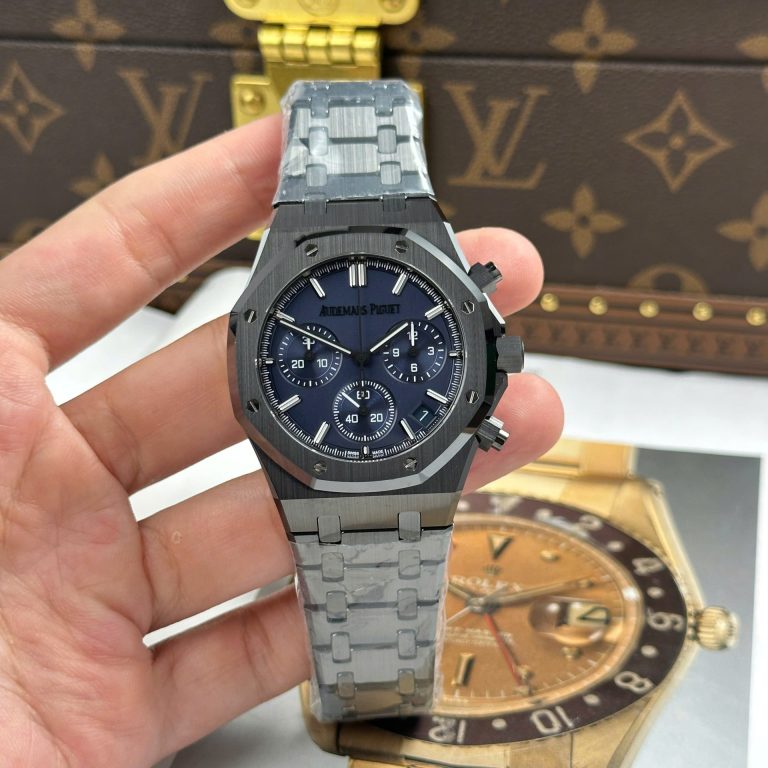
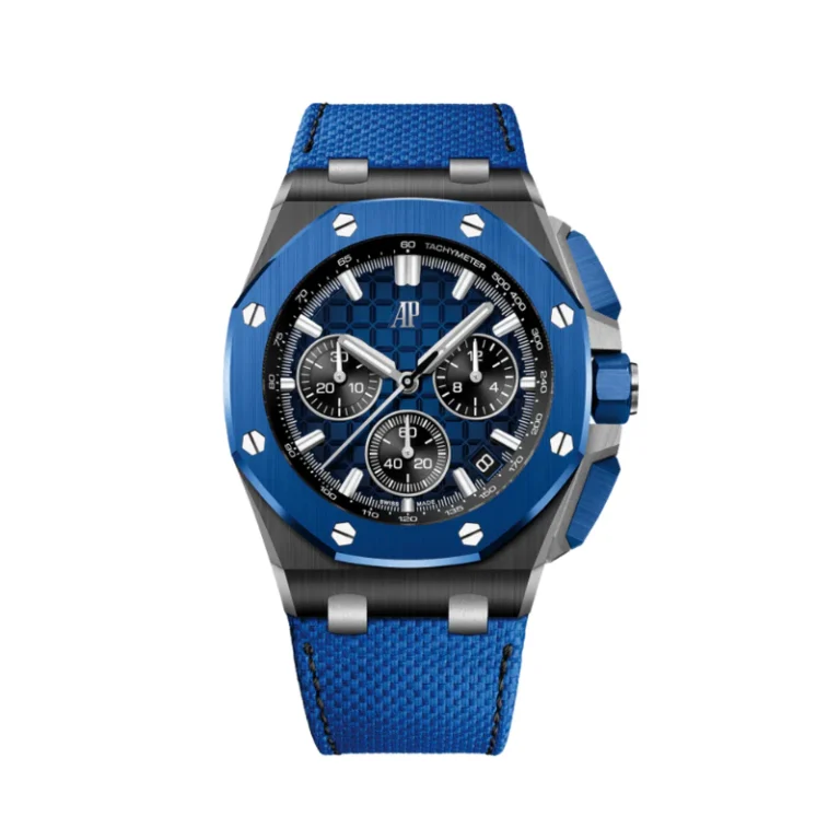
Blue is particularly difficult. One image can make a dial look deep navy, while another makes the same surface appear much brighter. Black, gray, white, green, and other colors bring their own problems. A heavily lit product photograph shouldn’t decide the matter by itself.
Blue Royal Oak dials show how easily supplier photography can distort a comparison. Studio lighting exaggerates saturation. Dark lighting can push the dial toward black. Crystal reflections change the apparent shade again.
If color matters to you, compare straight-on and angled images. Look at bright light, then ordinary indoor light if that view is available. After the color, return to the texture. A strong dial should still look convincing after the dramatic lighting disappears.
Many Royal Oak configurations have relatively uncluttered dials, so the date gets more attention than its small size suggests. Check centering first, then inspect several dates if possible. Double-digit dates often expose alignment problems more clearly than single digits.
Font weight matters too. A date wheel that looks unusually bold pulls attention away from the rest of the dial. Study the window’s position against the exact reference, since date placement can change between generations and movement layouts. This is another reason to identify the watch before judging the replica.
These references often appear in the same conversations because they belong to the same broad Royal Oak family. They aren’t interchangeable. Dial layout changes, case proportions change, and movement architecture changes. A detail that looks normal on one generation can be wrong on another.
Use the 15400 as the visual reference for a 15400-style replica. Do the same with a 15500 or 15510. Factory discussions blur the generations because the watches share the same general design, but the family resemblance isn’t enough for a close comparison. With a watch this dependent on proportion, generation changes the inspection.
Thin Royal Oak references create a different problem. A watch can get the dial, bezel, bracelet, and basic diameter right, then miss the character because the case is too thick.
Side-profile photographs deserve real attention here. Check the bezel, mid-case, caseback, and crystal. Then look at the bracelet attachment. A thin Royal Oak should look intentionally slim from the side, not like a standard automatic with a smaller dial. Thickness belongs to the design itself; once the profile is wrong, the watch changes character.
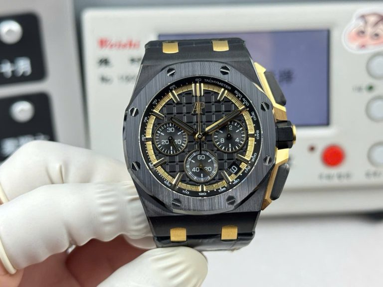
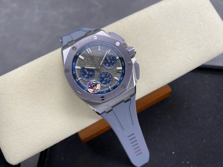
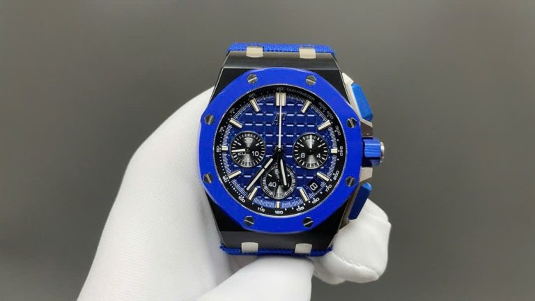
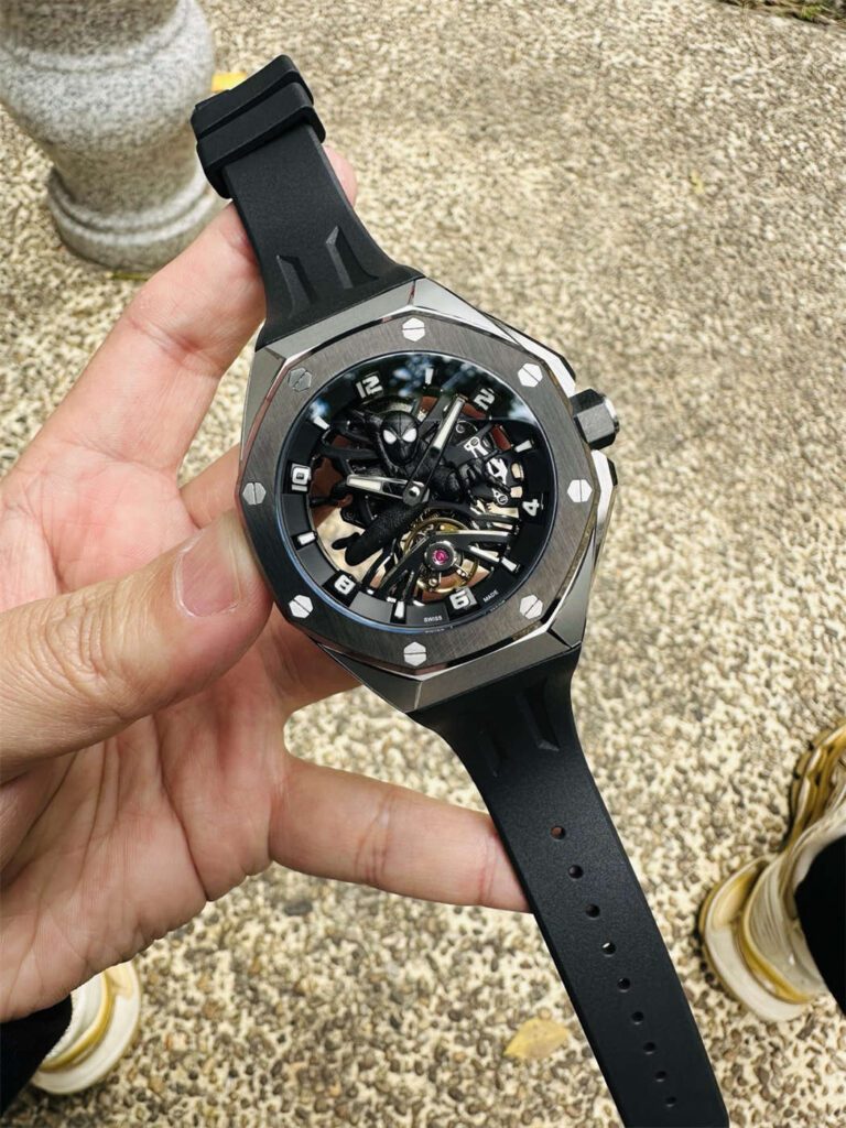
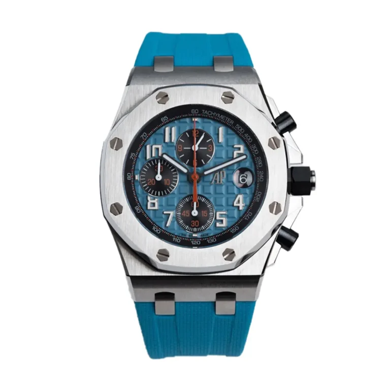
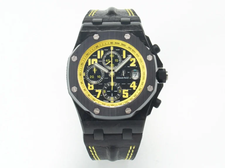
The Offshore shouldn’t be judged with the same checklist as a standard Royal Oak. It’s larger, more aggressive, and more complicated. Pushers, crown guards, thicker cases, rubber straps, chronograph subdials, and larger bezels all enter the picture.
The extra visual mass gives the design more room, but it doesn’t excuse clumsy construction. Case thickness still needs to make sense. Pushers should sit correctly, chronograph operation should work, and the rubber strap needs to fit the case without looking forced.
A standard Royal Oak rewards restraint. An Offshore asks whether a lot of components can work together without becoming awkward. Treat the two families separately.
Once a chronograph enters the picture, photographs stop answering the important questions. Start it, stop it, and reset it. Watch the central seconds hand and check the subdial counters. Everything should return to its resting position correctly.
Pay attention to pusher feel as well. A beautiful dial can’t tell you how the chronograph mechanism behaves. Movement architecture matters because subdial position is tied to what sits underneath the dial. If the movement forces the counters into the wrong places, the entire face of the watch changes.
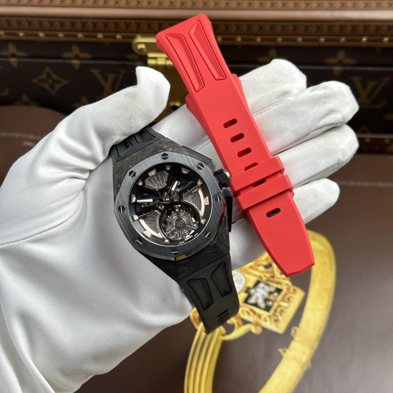
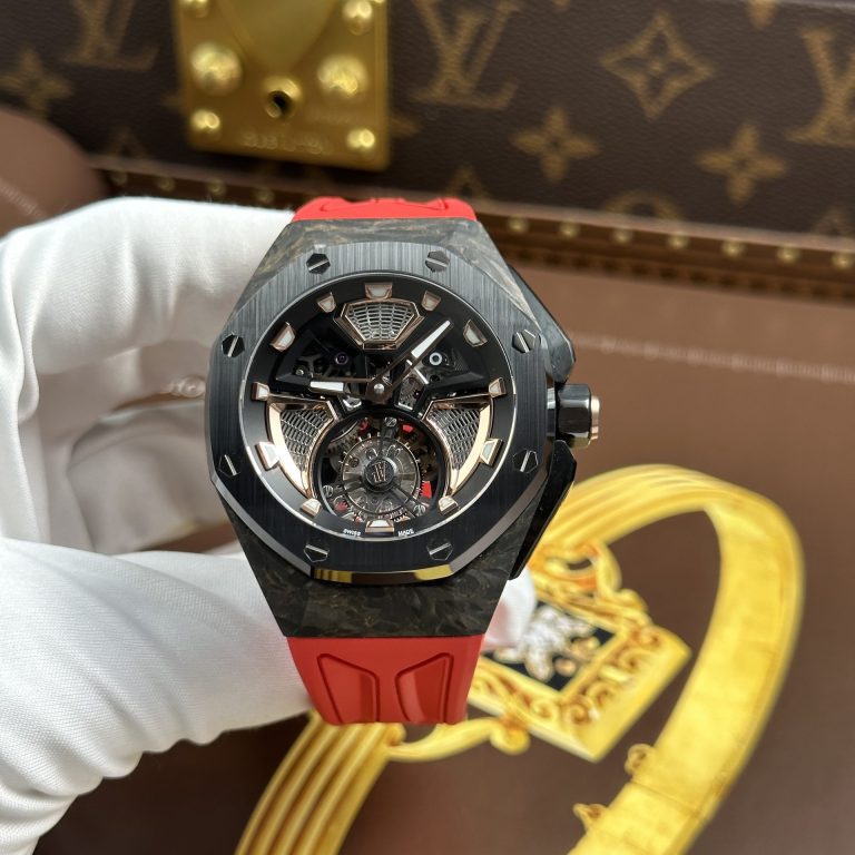
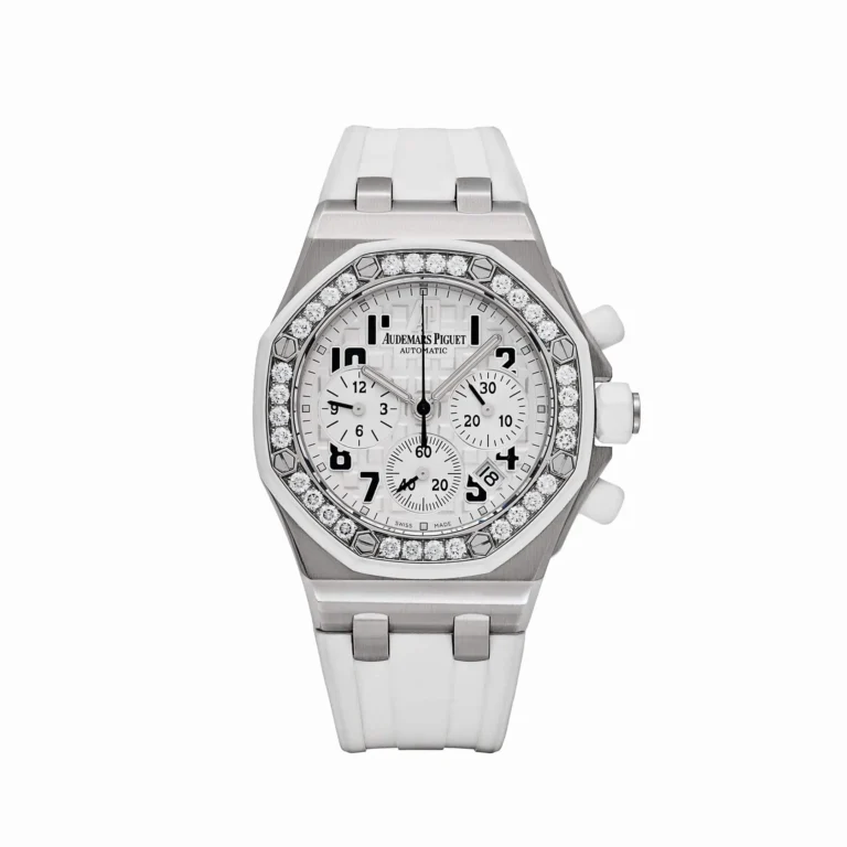
Steel Royal Oaks put the focus on brushing and polished bevels. Ceramic changes the comparison: surface texture, edge treatment, and the way the material reflects light all behave differently.
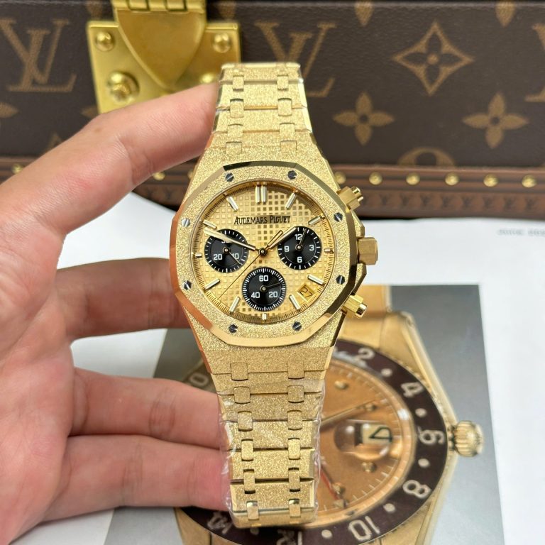
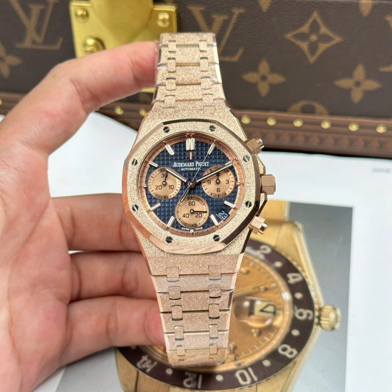
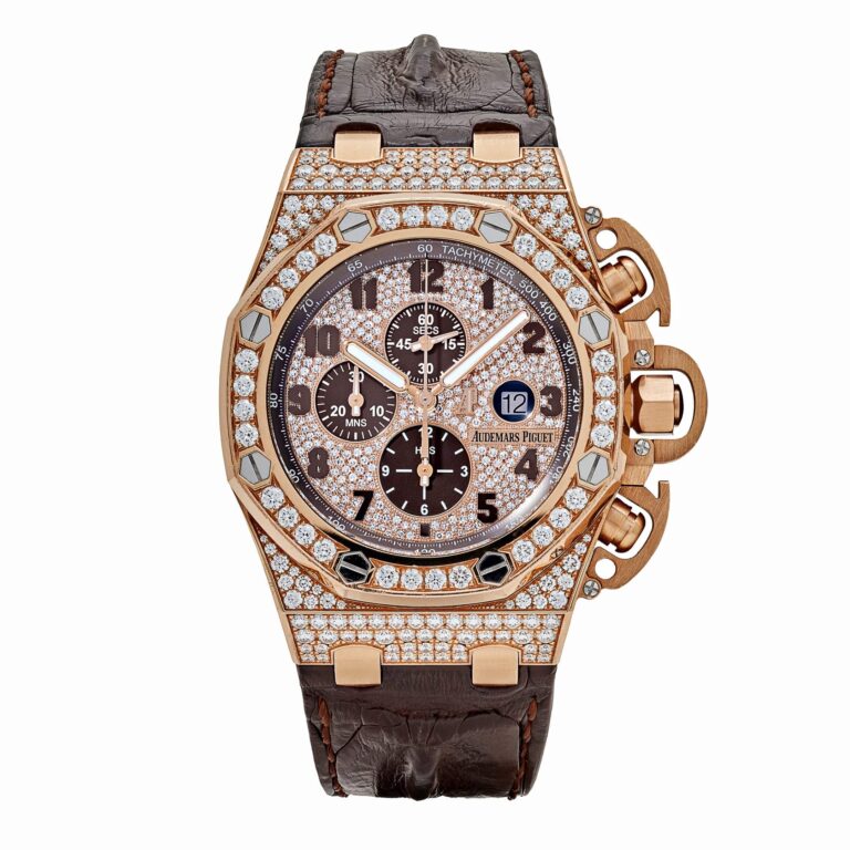
Gold-tone versions add color consistency to the inspection. Compare the case with the bracelet, then check the bezel, crown, and clasp. If one part leans noticeably more yellow or more pink than the others, the watch can look pieced together. Bright photography hides a surprising amount of mismatch. Normal daylight usually tells you more.
Weight makes more sense once the configuration is clear. A steel Royal Oak shouldn’t be judged by the same expectation as a gold-tone or weighted build. Heavy doesn’t automatically mean better. The useful question is whether the mass suits the watch and sits in the right places.
A heavy case connected to an unusually light bracelet can make the watch head dominate the wrist. A slightly lighter piece with better distribution may feel more natural. Integrated designs make this relationship obvious because the case and bracelet behave like one object on the wrist.
Many AP-style replicas expose the movement through the back, giving buyers another visual area to inspect. Decoration matters, but it shouldn’t replace functional checks. Look at the rotor, visible bridges, and finishing. Then wind the watch, set it, and check the date where applicable. Operate the chronograph if the watch has one.
Check the actual power reserve rather than assuming the number in a listing applies perfectly to every individual watch. A convincing movement appearance is useful. A functioning watch is more useful.
AP factory discussions often mention APSF, ZF, 3KF, and other names depending on the reference. Those names narrow the search, but they don’t settle the comparison. A factory can be strong on one Royal Oak configuration and less convincing on another.
A thin model creates different problems from a standard automatic. An Offshore requires different checks from a three-hand Royal Oak, while a ceramic model changes the finishing comparison again. Rather than asking which factory makes the best AP replica, narrow the question:
Factory names become useful once they’re attached to a particular watch.
With an AP, I wouldn’t begin at the center of the dial. I’d start with the entire silhouette: bezel, case, first bracelet links, and taper viewed together.
Then I’d turn the watch slightly and check how the brushed and polished surfaces meet. I’d look at bezel thickness and case profile before moving to the dial. Texture, markers, printing, hands, and date come next.
After that, I’d inspect the bracelet more closely: articulation, end-link geometry, and clasp. Finally, I’d check the movement and functions. That order works because many of the biggest AP problems are structural rather than microscopic. If the case and bracelet relationship is wrong, a perfectly printed logo can’t save the watch.
Do not begin with the factory name. Begin with the watch.
Royal Oak or Offshore? Standard automatic or chronograph? Thin case or conventional automatic proportions? Steel, ceramic, or gold-tone? Bracelet or rubber strap?
Then narrow the comparison to the exact reference and generation. For a standard Royal Oak, bracelet integration and case finishing may dominate. For a thin reference, case profile becomes the main concern. For an Offshore chronograph, movement function and pusher operation carry more weight.
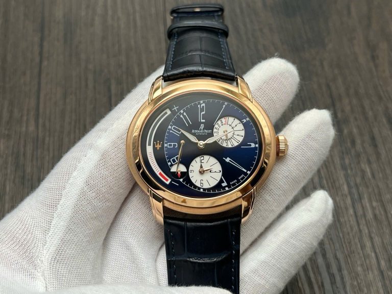
ReplicaWatchesCo.com carries Audemars Piguet replica watches across Royal Oak and Offshore models, different dial configurations, materials, movements, and factory versions.
With AP, the complete shape usually tells you more than the specification sheet. Look at the bezel, case, bracelet, dial, and movement together. They should look as though they belong to one design rather than having been assembled separately.
| Movement | |
| Case Material | |
| Diameter | |
| Thickness | |
| Bezel | |
| Crystal | |
| Power Reserve | |
| Waterproof |
Browse our collection of 1:1 CNC-milled clone timepieces and select a watch for precision regulation.
Explore The Collection →