Explorer
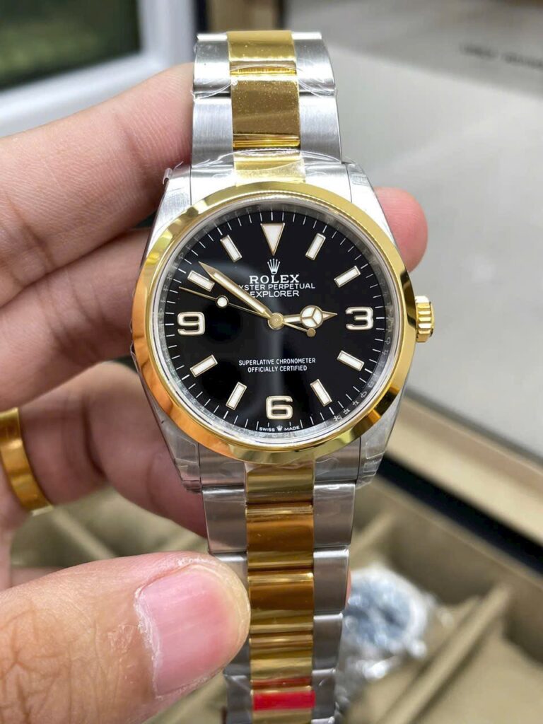
Rolex Explorer 124273 36mm SS (VS Factory Super Clone) Black Dial – Calibre 3230 Automatic
36 mm
Stainless Steel
RLX-124273-5841
Call: +1 (800) 729-2661
sales@replicawatchesco.com
The Explorer gives a replica very little room to hide.
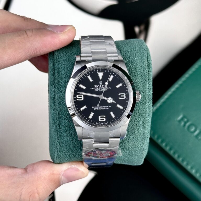
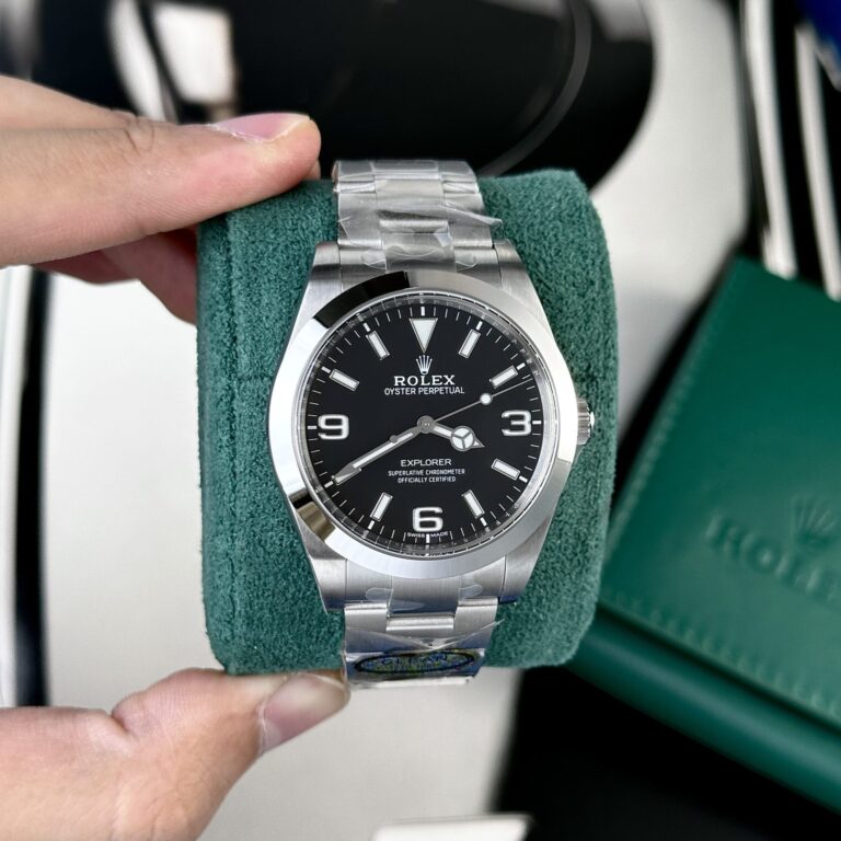
There is no ceramic bezel to pull your eye away. No chronograph subdials. No date window, two-tone bracelet, or busy dial layout. The watch gives you a black dial, three large Arabic numerals, baton markers, a smooth bezel, and an Oyster-style bracelet.
That simplicity makes Rolex Explorer replica watches unusually difficult to get right. If the 3, 6, and 9 are too thick, the printing sits too high, the case feels oversized, or the bracelet leaves the lugs awkwardly, you see it almost at once.
For ReplicaWatchesCo.com, I’d begin with the reference and case size. Then I’d judge the dial as one complete surface before worrying about the factory or movement.
The Explorer has moved through several sizes, and those watches shouldn’t be treated as one model with different numbers in a specification table.
The older 214270 generation brought the Explorer to roughly 39mm. The 124270 returned it to the traditional 36mm format, while the newer 224270 moved back up to 40mm.
The change affects more than wrist presence. Dial space expands or contracts. The gap between the numerals and the case shifts. The bracelet looks different beside the watch head. Even the familiar 3-6-9 layout carries a different visual weight depending on how much black dial surrounds it.
Pick the size first. A good 36mm Explorer should look compact and deliberate. A 40mm version shouldn’t look like the 36mm dial was simply pushed outward until it filled a larger case.
The Explorer dial is built around those three numerals. They’re large enough to draw the eye immediately, but they shouldn’t overpower the baton markers or make the center of the dial feel cramped.
Look at their shape and thickness, then consider the empty space around them. The 3 and 9 should balance across the dial, while the 6 anchors the lower half. Compare all three against the hour markers rather than judging each numeral in isolation.
If the numerals are too bold, the dial starts to feel crowded. Too thin, and the Explorer loses the visual weight that makes the layout recognizable. It’s a simple arrangement. Small proportion errors have nowhere to disappear.
The Explorer invites a different sort of over-analysis than the Daytona. There are fewer details, so people tend to enlarge whatever remains: a tiny edge on the 6, a corner on the 9, or a slightly different curve in the 3.
Those details are worth checking later. They shouldn’t be the first test.
Start at a normal viewing distance. Does the dial feel balanced? Do the Arabic numerals look naturally sized beside the markers? Does anything jump out before you’re looking for it? Those answers tell you more about the watch than ten minutes spent studying one corner of one numeral.
There isn’t much color on an Explorer, so the black dial carries nearly all the visual work. Look at it from more than one angle. A replica dial can look deep and clean in direct product photography, then appear washed out once reflections enter the picture.
The crystal is part of this judgment. A good black dial can look weak behind a poor crystal, especially when glare flattens the surface. Check the minute track around the perimeter as well. The spacing should remain consistent instead of tightening or wandering near the numerals.
Dial text deserves the same inspection. It should sit cleanly in the upper and lower halves without crowding the center. There is no date window or bezel insert competing for attention, so every bit of uneven printing stays visible.
The large numerals and hour markers provide plenty of luminous area. Lume color matters before the room even gets dark. In daylight, the filled numerals should sit naturally against the black dial rather than looking overly green, gray, or chalky.
Then check the consistency. The 3, 6, and 9 shouldn’t be dramatically brighter or darker than the surrounding markers unless the lighting is creating that effect. At night, brightness is useful. Evenness is more useful. One numeral glowing much harder than the others makes the dial look uneven right away.
Listings rarely give this detail much attention because nearly every product image is taken under bright light. If lume photos are available, use them as supporting evidence, not as a substitute for judging the rest of the watch.
The Explorer hands lack the complexity of a GMT or chronograph, but they’re highly exposed against the open black dial. The Mercedes-style hour hand, minute hand, and seconds hand all need to look proportionate.
A hand that’s slightly too short becomes easier to spot when nothing else is happening on the dial. The seconds hand gives you another alignment point: at rest or in motion, look at how it reaches toward the minute track.
The hand stack deserves a side-angle look, too. The center shouldn’t appear unnecessarily tall or awkward simply because the watch has a restrained dial.
The Explorer bezel sits at the opposite end of the design from a Submariner or GMT bezel. It has no insert or scale to command attention. Its job is to frame the dial.
Width and polishing therefore matter more than decoration. A bezel that’s too thick makes the dial opening feel small. One that’s too thin can leave the case looking oddly broad. Look at reflections along the polished surface, then step back and judge the whole watch.
A well-proportioned Explorer bezel should register as part of the case before you start thinking about the bezel itself.
This is another reason not to compare every Explorer as though the references were interchangeable. The older 39mm generation, newer 36mm generation, and newer 40mm version carry different proportions.
Check lug length and width. Look at the transition from the case into the bracelet. A replica can list the right diameter and still have the wrong stance because the lugs are too long, the case sides are too thick, or the bracelet looks narrow underneath the watch head.
The Explorer has no rotating bezel or oversized crown guards to distract from those problems. The case has to stand on its own.
The Explorer looks straightforward face-up. Turn it sideways and the useful information starts to pile up.
Look at case thickness, crystal height, caseback depth, and the way the bracelet leaves the lugs. A watch can photograph beautifully from the front and still sit too tall because the mid-case or caseback is heavy.
The issue stands out most on the 36mm version. A compact diameter combined with unnecessary thickness changes the whole character of the watch. The Explorer should feel sturdy, not like a thick watch squeezed into a smaller footprint.
There isn’t much visual drama on an Explorer. The bracelet therefore occupies more of the complete watch than buyers sometimes expect.
Check the end links first. They should meet the case cleanly instead of leaving a visible gap or an awkward step. Then look at articulation. The first few links should move naturally rather than creating a stiff transition from the lugs.
Brushing needs attention as well. Broad, simple surfaces make inconsistent finishing easy to see. The clasp should operate cleanly, without excessive looseness or sharp edges.
This is the sort of watch that can end up on the wrist frequently, so bracelet comfort deserves more weight than an impressive macro photograph of the dial.
The smaller Explorer creates a particular bracelet problem. The bracelet needs enough substance for a sports watch without overwhelming the compact case.
If the first links look too wide or heavy, the 36mm format loses some of its balance. If they look too narrow, the case can appear to sit on top of the bracelet instead of flowing into it.
Look at the watch as one shape from case to clasp. The smaller diameter makes that relationship hard to miss.
Modern Explorer replicas may be sold with 3230-style clone movements or other automatic movements, depending on the factory and version. That information has a place, but the Explorer doesn’t need movement discussion to take over the comparison.
There is no chronograph to operate, no independent GMT hand, and no date mechanism to inspect. The useful checks are more basic: how winding feels, whether the crown positions engage clearly, whether the seconds hand stops when setting the time on a movement designed to hack, how consistently the watch runs, and what power reserve that particular movement actually delivers.
A familiar movement number gives you useful context. It doesn’t replace checking the watch’s operation.
The crown is easy to overlook on the Explorer because there are no pushers or large crown guards competing for attention. That also makes a wrong-looking crown easier to spot.
Check its size against the case and see how it sits between the guards. Then use it. Winding and setting should feel deliberate rather than loose or rough.
On the 36mm version especially, an oversized crown can alter the side profile more than expected. It changes the visual balance before you ever start thinking about the movement inside.
Factory names can narrow the search for Rolex Explorer replica watches, but the name is not useful without the reference attached to it.
Start with a specific configuration such as 124270, 36mm, black dial, Oyster bracelet or 224270, 40mm, black dial, Oyster bracelet. Then compare the available versions for that exact watch.
Look at the numerals, case size, lug proportions, bracelet, and crystal before considering the movement and factory. One factory may produce a convincing 36mm Explorer while another handles the 40mm proportions more successfully. Asking which factory makes “the best Explorer” without saying which Explorer you’re discussing doesn’t get you very far.
Start with the complete watch. Does the size look right? Do the 3, 6, and 9 carry the dial without dominating it? Does the bezel frame the dial naturally?
After that, move into the smaller details: marker spacing, hand proportions, lume color, dial printing, and crystal reflections. Then inspect the case from the side and study the bracelet connection at the lugs.
Use the crown last and check the movement operation. The Explorer rewards this order because its larger mistakes are usually proportional. You don’t need a microscope to see them.
Narrow the watch down before comparing factory versions. Keep the comparison tied to:
Then compare versions built around the same reference. A 36mm 124270 and a 40mm 224270 share the Explorer name and the same basic dial idea, but they shouldn’t be judged as interchangeable watches.
ReplicaWatchesCo.com carries Rolex Explorer replica watches across different generations, case sizes, movements, and factory versions. Start with the proportions. There isn’t enough visual clutter on this model to hide them.
| Movement | |
| Case Material | |
| Diameter | |
| Thickness | |
| Bezel | |
| Crystal | |
| Power Reserve | |
| Waterproof |
Browse our collection of 1:1 CNC-milled clone timepieces and select a watch for precision regulation.
Explore The Collection →