Patek Philippe
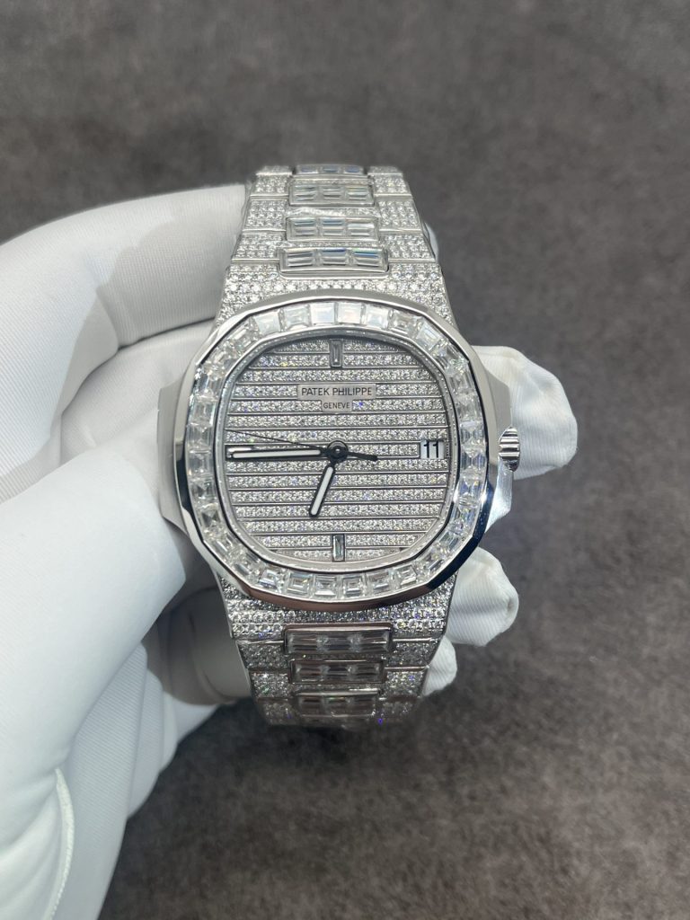
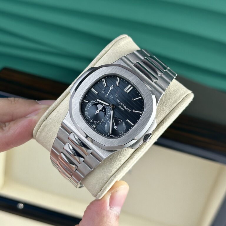
Patek Philippe Nautilus 5712/1A-001 40mm SS (Super Clone) Black Dial with Date Display – P.3000 Calibre Automatic
40 mm
Stainless Steel
PP-5712-39339
Call: +1 (800) 729-2661
sales@replicawatchesco.com
Patek Philippe replicas create a different problem from watches that rely on size, color, or a complicated bezel to make an impression.
Most of the popular designs are restrained. A Nautilus has a simple dial, a thin case, and an integrated bracelet. An Aquanaut trades much of that metal for a rubber-style strap. A Calatrava can be quieter still. Add moonphase, power reserve, or a second time zone and the mechanics become more involved, yet the watch usually avoids looking crowded.
That restraint makes Patek Philippe replica watches difficult to compare. If the case is too thick, you notice it. If the bracelet leaves the case awkwardly, you notice it. A dial with overdone texture or a badly placed date has nowhere to hide.
For ReplicaWatchesCo.com, I judge Patek replicas by how naturally the complete watch comes together. The simpler the design, the less room there is for a weak proportion or careless transition.
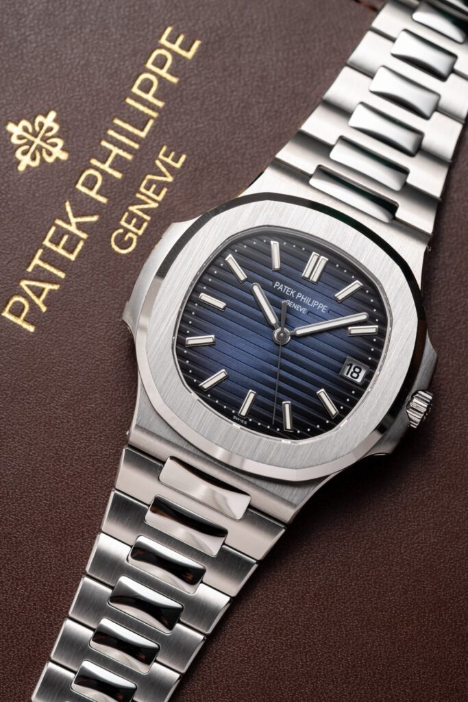
The Nautilus case is recognizable immediately, but reducing it to the rounded-octagonal bezel misses most of the work. Look at the complete outline: the bezel meeting the case, the slimness of the profile, the visual weight of the side extensions, and the way the bracelet leaves the case.
A replica can get the bezel reasonably close and still miss the character of the Nautilus because everything beneath it is too thick. Straight-on photos are forgiving. Turn the watch sideways and the proportions may tell a different story.
That side view deserves more attention than it usually gets in listings. The mid-case, crystal, and caseback should read as parts of one design. If one section swells out, the watch starts looking heavy before you ever put it on.
Replica comparisons lean heavily on diameter. With many Patek models, thickness tells you more. The Nautilus depends on a relatively flat profile, and extra height through the mid-case, crystal, movement, or caseback changes the whole impression.
The thinnest replica doesn’t automatically win. A thin case with poor shaping is still poor work. Look at how the bezel, mid-case, and caseback divide the total height. The watch should look deliberately slim, not squeezed into a smaller package.
That distinction is easy to miss in a front-facing product shot. A watch can have the right diameter and still sit too high on the wrist. I’d start with the side profile before getting distracted by small printing details.
The Nautilus family looks consistent from a distance, which encourages lazy comparisons. The references create different inspection problems.
The 5711 has one of the cleanest layouts, so case thickness, dial texture, bracelet fit, and date placement carry much of the burden. The 5811 belongs to a newer generation and changes details that should be judged against that reference rather than against the older model.
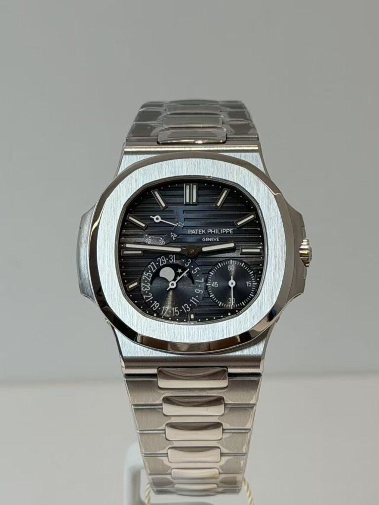
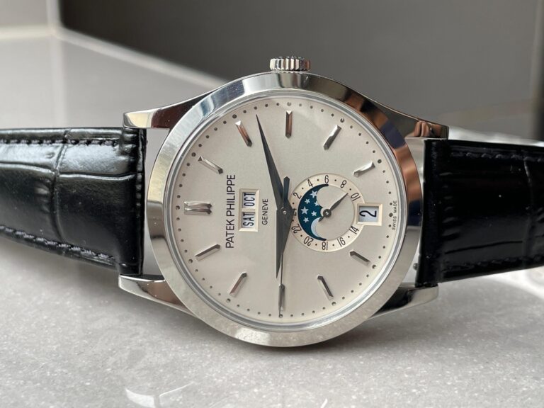
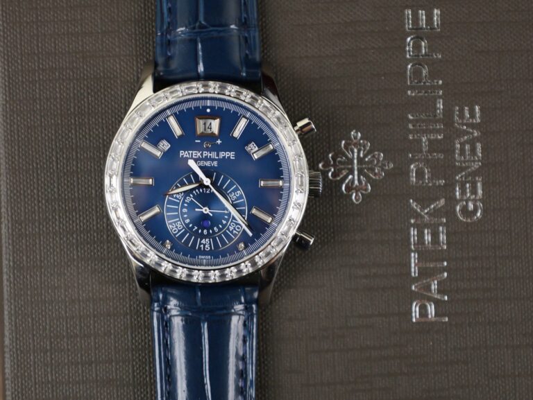
The 5712 is another matter. Its power reserve, moonphase, date, and small seconds create an asymmetric layout that demands attention to subdial positions and functional indications. A 5711-style replica might succeed or fail on a few broad proportions. A 5712 can look wrong because one element sits slightly too far from the next.
Putting both watches through the same checklist tells you very little. The reference has to be fixed first.
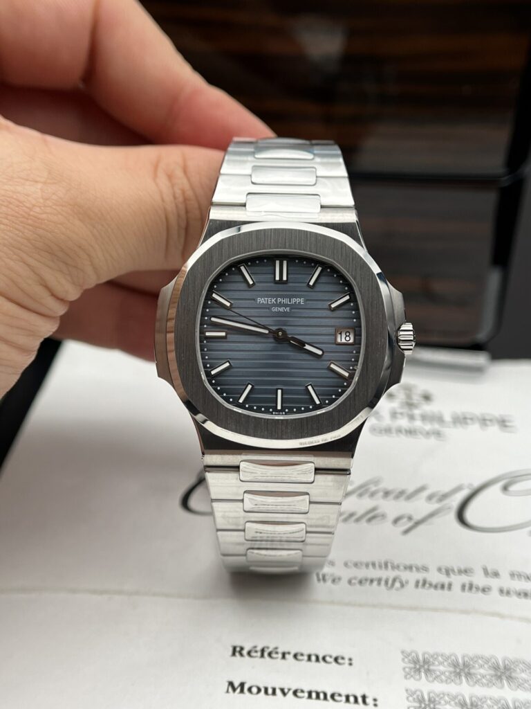
Horizontal dial texture is one of the easiest Nautilus details to recognize and one of the easiest to overdo. Grooves that are too deep make the surface busy. Grooves that are too weak leave it looking flat.
Color complicates the comparison. Blue, green, gray, white, and other treatments change with the light. A blue Nautilus photographed under strong lighting may look much brighter than the same watch indoors, so one listing photo is a poor basis for judgment. Look from several angles, then check how the markers and hands sit over the texture.
They should remain clear without appearing pasted on top. The texture is there to support the dial, not to swallow the indicators. A small amount of restraint usually looks more convincing than a surface trying to announce itself.
The 5712 looks intentionally uneven. That still leaves plenty of ways to arrange it badly.
Moonphase, date, small seconds, power reserve, text, and applied markers all occupy different areas of the dial. A replica can include every one of those pieces and feel wrong because the spacing between them is off. This is a watch where the whole dial deserves a first look before individual printing gets your attention.
Step back. Does the arrangement feel balanced? Only after that should you inspect subdial placement, numerals, and the individual indications. The layout is asymmetric by design; it should not look accidental.
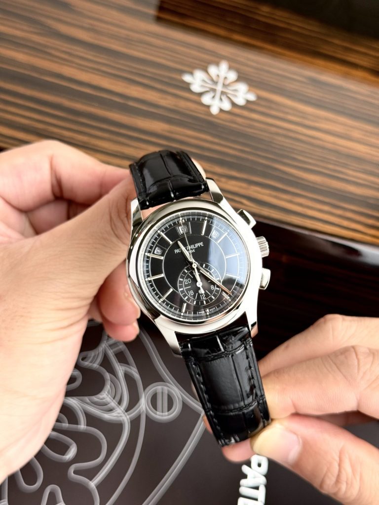
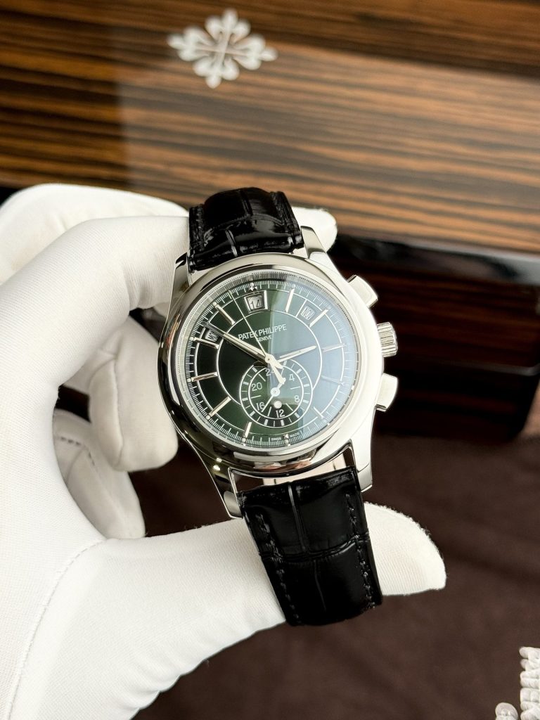
On a complicated Patek-style replica, decorative accuracy covers only half the job. If the watch shows a moonphase, check how it operates. If it has a power-reserve display, find out whether the indicator works or simply occupies the right place. A date shown through a subdial deserves the same check.
Small seconds and other indications also need to behave as advertised. A complicated dial can look excellent in a photograph while several displays do very little once the watch is running. That may not rule out a purchase for every buyer, but it should be clear before the comparison is made.
Appearance and function are separate questions. Treating them as one is how a pretty listing turns into a disappointing watch.
The Nautilus bracelet deserves nearly as much attention as the case because it continues the watch’s shape instead of reading as a separate band.
Start with the first links. They should meet the case cleanly and leave it at a natural angle. Then follow the taper. The bracelet should narrow gradually rather than stay wide until the clasp. Brushed and polished surfaces also need to remain distinct without becoming mirror-bright.
Use the bracelet as well as looking at it. Does it articulate naturally? Does it feel loose? Does the clasp operate cleanly? A convincing dial attached to a poor bracelet stops feeling convincing very quickly.
The first link on each side controls how the Nautilus sits on the wrist. If it is too stiff, the watch can wear wider than its case dimensions suggest. If it drops too sharply, the case looks disconnected from the bracelet.
Flat product photography often hides this problem. Wrist shots reveal more because the bracelet has to bend around an actual curve rather than lie neatly beside the case. A Nautilus should flow around the wrist, not look like a watch head with a bracelet hanging from it.
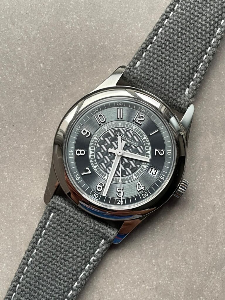
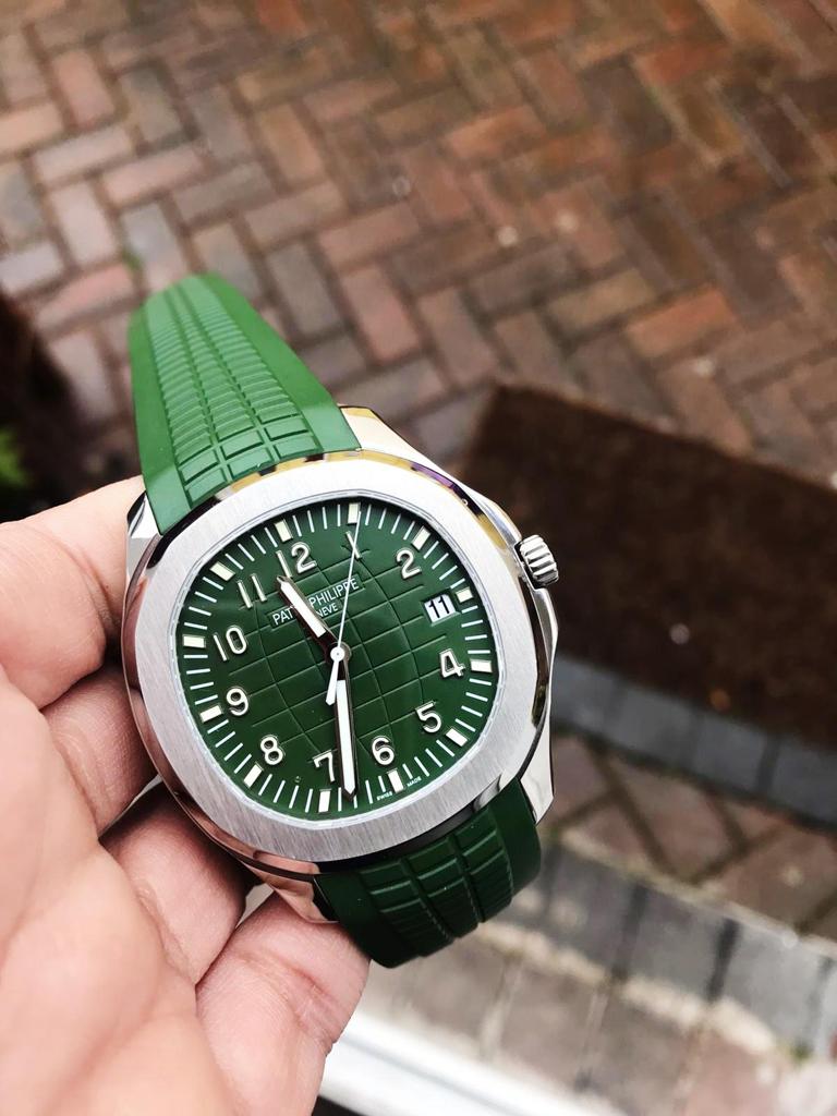
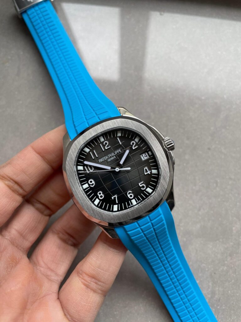
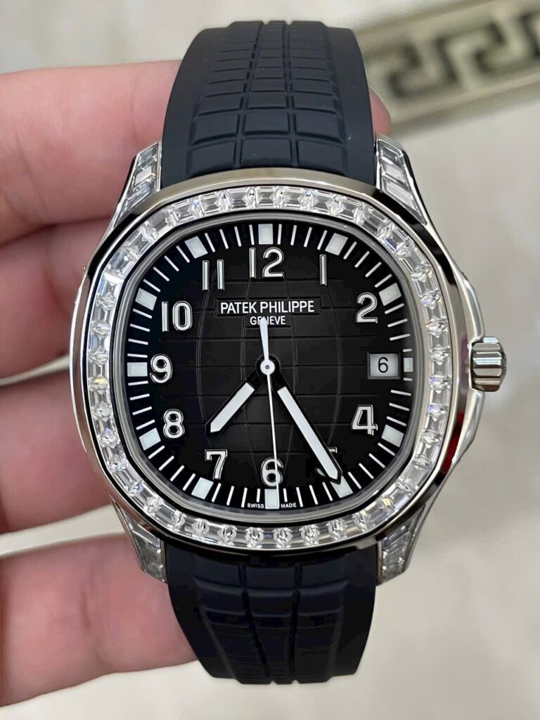
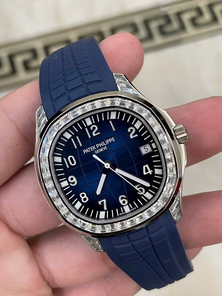
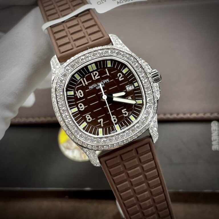
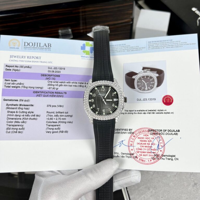
The Aquanaut shares some Patek design language with the Nautilus but feels different immediately. The rubber-style strap changes the balance of the watch, and there is less metal to inspect. Attention shifts to the case, dial, strap fit, and clasp.
The embossed dial needs its own comparison. Texture should remain consistent, with markers sitting naturally inside it. The strap pattern should belong to the overall design rather than look like generic rubber attached to a Patek-style case.
Strap fit is easy to underestimate. If the strap leaves the case at an awkward angle, you see it right away. The case and strap need to meet with enough structure to hold the shape without making the watch look stiff.
The Aquanaut family changes noticeably by reference. A 5167-style watch has different proportions from the larger 5168, and that affects the dial, case, and strap together.
A factory that produces a convincing 5167 does not automatically produce an equally convincing larger version. Check each reference on its own. The larger case gives small proportional errors more room to show: strap width, case thickness, dial spacing, and the relationship between the case and strap all need to grow together.
A stretched version of the smaller watch usually looks stretched. The larger format needs its own balance.
A strap can have the correct-looking texture and still feel wrong. Check flexibility, thickness, and the area where it meets the case. A strap that is too stiff pulls the case upward. One that is too soft feels weak beside the watch head.
The clasp deserves a close look too. It should feel substantial enough for the watch without turning bulky. This is one of the parts that becomes more noticeable after days of use because you handle it every time the watch goes on or comes off.
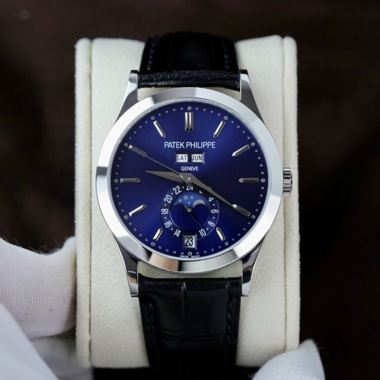
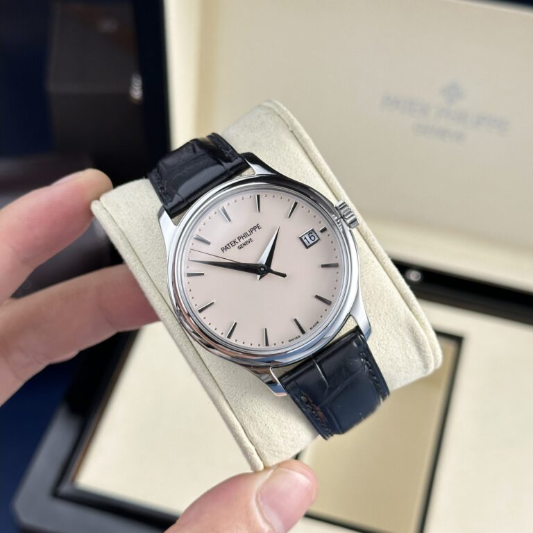
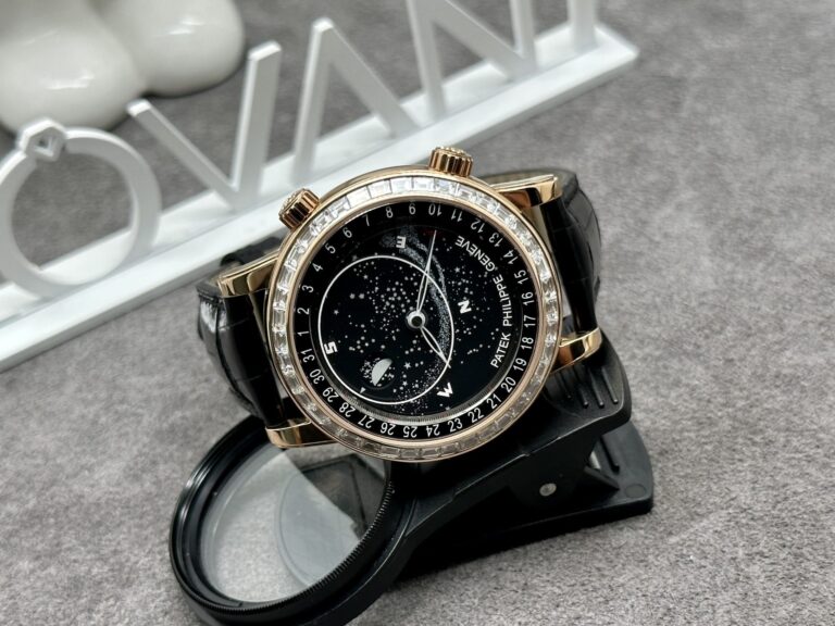
A simple Calatrava-style watch can look easier to reproduce because there is less going on. In practice, simplicity raises the pressure on proportion. The dial is open, the markers are exposed, the bezel is plain, and the case is relatively thin.
A slightly wrong hand length or an overly thick case can stand out more than it would on a busier watch. With a Calatrava-style replica, I’d look at the case profile first, then dial balance, hands, markers, and crown. There is little reason to get lost in factory comparisons until those basics look right.
The quiet design leaves every transition visible. A lumpy lug, a heavy bezel, or a crown that sits too high has nowhere to disappear.
On simpler Patek references, the date can attract surprising attention. Check its centering, then look at several different dates rather than judging one single-digit example.
Double-digit dates expose alignment problems more clearly. Font weight matters too. A heavy date wheel looks out of place on a dial built around thin markers and restrained printing. The date should read as part of the design, not as a separate component dropped into an available window.
Patek-style sports cases often mix polished and brushed surfaces, so the transitions deserve a close look. A polished edge should stay defined. Brushing should follow the shape consistently.
Over-polishing softens the case until its geometry starts to disappear. At the other extreme, exaggerated edges make the replica look overly machined. Watch how light moves across the case instead of relying on a static close-up of one polished bevel.
The finishes should be visible without making the watch look artificially glossy. Light moving across several surfaces tells you more than a single dramatic reflection.
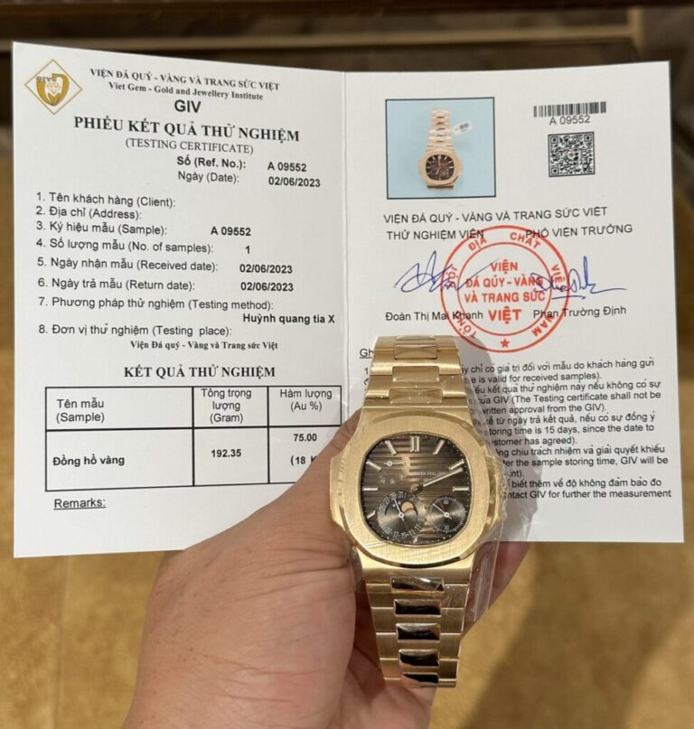
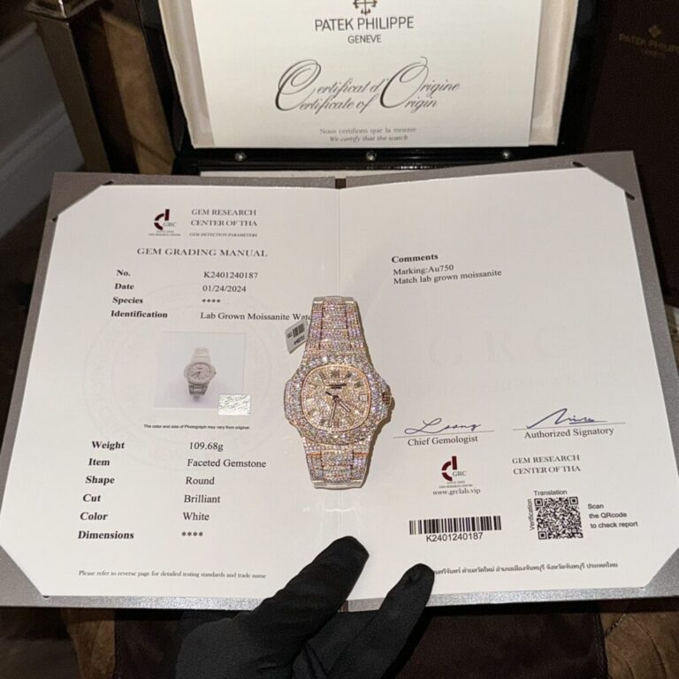
Moving away from steel introduces another check: consistency of tone. Compare the case with the bracelet, crown, clasp, and polished side surfaces. All of those pieces should appear to belong to the same watch.
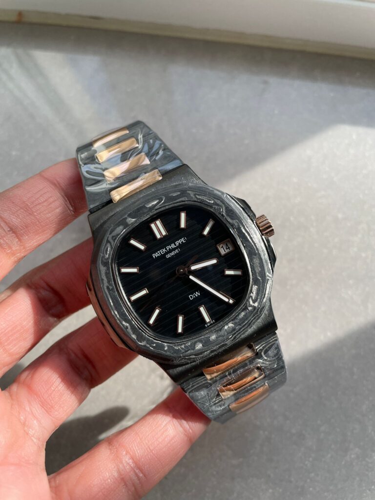
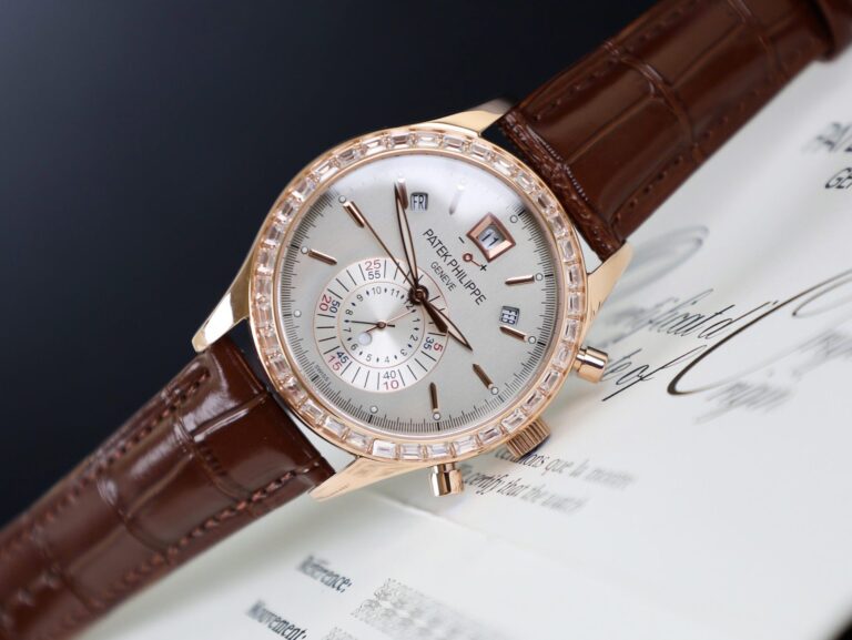
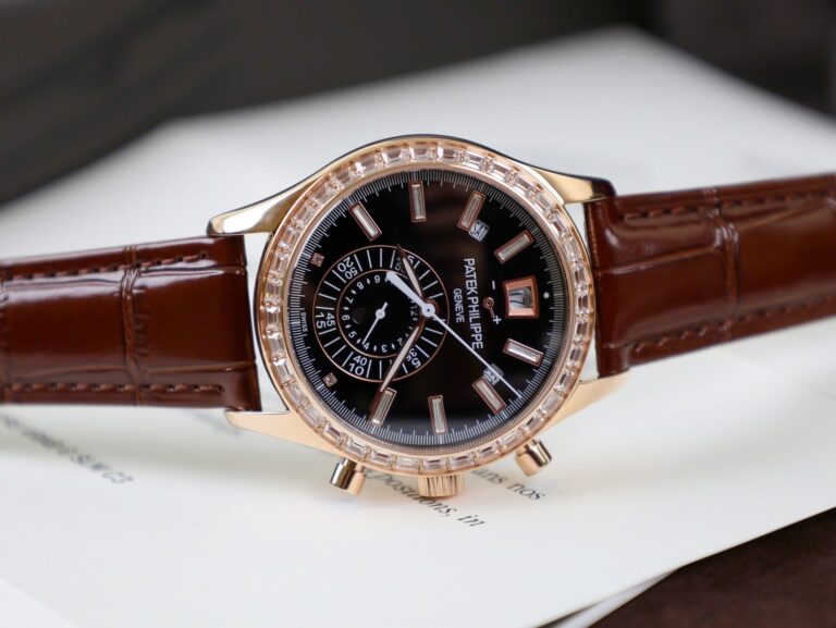
A small difference can become obvious in daylight even when studio photography hides it. Rose-gold-style finishes are especially sensitive; too much pink changes the character quickly. Yellow-gold-style finishes can drift too bright.
The goal is not maximum shine. It is a consistent color across the parts that are supposed to match.
Some replica listings make weight a major selling point. It can be useful information on certain Patek configurations, but it needs context. A steel Nautilus and a gold-tone Nautilus create different expectations. An Aquanaut on a rubber strap creates another.
The better question is whether the watch feels balanced. A heavy case paired with an unusually light bracelet can feel wrong. A large number on a specification sheet does not make a replica more convincing if the weight sits in the wrong places.
Many Patek-style replicas expose the movement through the caseback, giving buyers another area to inspect. Look at the rotor, visible bridge shapes, finishing, and decoration, but don’t stop at the view through the glass.
Wind the watch. Set it. Check the date. Operate the complications. Observe actual power reserve if that feature matters to you. A movement that photographs well but operates poorly remains a poor result.
The caseback can reveal an attractive layout, but use reveals whether the watch was built around something functional or merely arranged for a photograph.
Some movements are decorated to resemble the architecture of the reference while using a different movement underneath. Others attempt a closer clone-style architecture. Those approaches should not be treated as interchangeable.
Rotor engraving and bridge decoration provide only a starting point. Look at the layout, the position of key components, and the movement thickness. Then consider serviceability. A movement that photographs impressively may still be difficult to maintain later, and that tradeoff belongs in the comparison.
Patek replica discussions commonly mention factories such as 3KF, PPF, ZF, and others, depending on the model and production period. The names are useful, but they don’t settle the choice.
A factory known for a convincing Nautilus may not be the obvious choice for an Aquanaut. A 5711 and a 5712 create different movement and dial problems, while a complicated reference introduces another set of priorities.
Start with the actual watch:
Which reference?
Which dial?
Which material?
Bracelet or strap?
Which movement construction?
Only after those decisions should the factory name carry much weight. Otherwise, the label starts doing the thinking for you.
A useful inspection starts with the side profile. Case thickness is one of the fastest ways to see whether the proportions are heading in the right direction.
Next, view the complete watch from the front. Check the dial balance, the case-to-bracelet or case-to-strap transition, the date position, and the overall spacing. Don’t zoom in too early. A watch can have beautiful hands and markers while still being too thick or badly proportioned as a whole.
After the broad view, move closer to the dial texture, markers, hands, finishing, bracelet or strap, and clasp. Then use the watch: wind it, set it, check the date, and operate complications where applicable.
The order keeps small details from distracting you from the watch’s main shape.
Start by deciding which part of the Patek catalog you actually want: Nautilus, Aquanaut, Calatrava, or a complication-heavy reference. Then choose the exact reference and generation.
After that, compare case thickness, dial execution, bracelet or strap fit, movement architecture, functionality, and factory version. A 5711 should not be judged like a 5712. An Aquanaut should not be treated like a Nautilus with rubber attached. A simple Calatrava exposes different weaknesses from either one.
ReplicaWatchesCo.com carries Patek Philippe replica watches across Nautilus, Aquanaut, dress-watch, and complication-style configurations from different factory versions.
With Patek, the strongest replicas usually win through restraint. The case stays slim where the reference calls for it. The bracelet or strap continues the watch’s shape. The dial remains balanced. Any complication on the front makes sense once you use it.
| Movement | |
| Case Material | |
| Diameter | |
| Thickness | |
| Bezel | |
| Crystal | |
| Power Reserve | |
| Waterproof |
Browse our collection of 1:1 CNC-milled clone timepieces and select a watch for precision regulation.
Explore The Collection →