Rolex Replica Watches
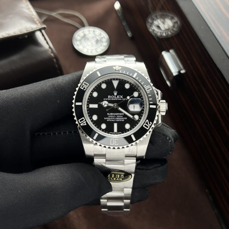
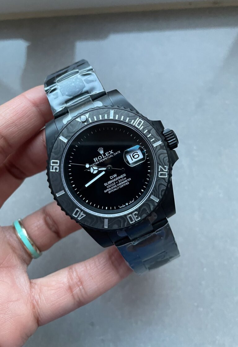
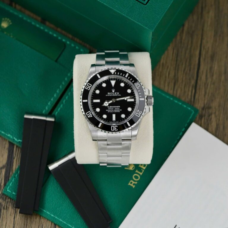
Rolex Submariner 116610LN 40mm SS (Clean Factory Super Clone) Black Dial on Stainless Steel Oyster Bracelet – Calibre 3135 Automatic
40 mm
Stainless Steel
RLX-116610LN-4475
Call: +1 (800) 729-2661
sales@replicawatchesco.com
The Submariner is easy to recognize and surprisingly difficult to choose well. Most modern versions share the broad outline: a black or colored ceramic bezel, round luminous markers, an Oyster bracelet, and the familiar Rolex dive-watch case. From across a room, that gets you most of the way there.
Compare individual references for a few minutes and the differences stop looking minor. A 124060 doesn’t give the same impression as a 126610LN. An older 116610LN carries its weight differently from the current generation. Add a green bezel, change the dial, remove the date window, or alter the case proportions, and you’re looking at a different take on the same basic watch.
Start with the reference you actually want, not the word “Submariner” in a listing title. Then judge how faithfully that particular watch handles its case shape, dial, bezel, bracelet, and the way it sits on a wrist.
This choice changes the Submariner more than buyers expect. The no-date model has a cleaner dial: no aperture at three o’clock, no Cyclops over the crystal, and no interruption to the ring of hour markers. The current 124060 is the obvious example.
For anyone drawn to the Submariner as a straightforward dive watch, the no-date layout stays closer to that original idea. Its symmetry is hard to miss once you’ve spent time looking at both versions.
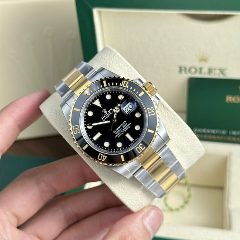
Date models introduce another focal point. The 126610LN, for instance, brings in the date window and magnifying lens, changing the entire right side of the dial. It looks busier, and the quality of the date display now has to hold up alongside the bezel, markers, and hands.
Neither layout wins by default. Pick the clean symmetry of a no-date reference or the familiar Rolex date presentation before getting lost in factory names, movement codes, or tiny finishing differences. Otherwise, you’re comparing watches that don’t really answer the same preference.
They’re often lumped together because all three are black Submariners. That’s too broad to be useful. The 124060 is the modern no-date model, with newer case proportions and a wider bracelet than the previous generation. The 126610LN uses much of that same current design language, then adds the date and Cyclops.
The 116610LN has a different presence. Its lugs look broader and more squared off, producing the heavier “maxi-case” character associated with that generation. Put it next to a current model and the shift in shape becomes obvious, especially where the case meets the bracelet.
If the previous generation’s broad, muscular look is what you want, the 116610LN makes visual sense. The 124060 and 126610LN have a more refined transition from case to bracelet in the newer design. The reference matters before anything else does.
A black Submariner looks almost too straightforward in a product photo: black dial, black ceramic bezel, white markers. It seems like there shouldn’t be much room for error. There is.
The dial needs to look deep and clean under normal light, not gray or washed out. A ceramic bezel should have enough gloss to read as ceramic without turning into a mirror. The white fill in the bezel numerals should be crisp, rather than chalky or piled on.
More revealing is the relationship between the two black surfaces. A dial that looks warm and flat next to a colder, shinier bezel leaves the watch looking mismatched, even if each component seems acceptable by itself. Side-by-side photos are useful here because a single watch can look convincing in isolation.
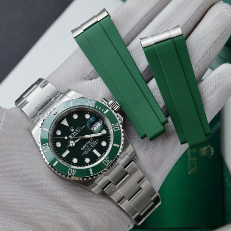
Green references have a different problem: color carries much of the watch’s identity. A 126610LV-style model depends on the relationship between its black dial and green ceramic bezel. Too bright, too blue, too yellow, or just too flat, and the watch changes character immediately.
Photos complicate the question. Ceramic bezels shift with outdoor light, indoor light, camera exposure, and reflections, so one image rarely settles the color. Look for views from different angles and under different conditions. A decent ceramic insert changes naturally as light moves over it; it shouldn’t resemble a flat painted ring.
Older green-dial references need the same attention. When both dial and bezel carry strong color, buyers tend to fixate on getting one shade right and overlook how the two shades sit together. That pairing is the point.
Submariner discussions spend too much time on dial printing and not enough on the case. That’s backward. The case gives the watch its stance before anyone gets close enough to inspect a line of text.
Look at the lugs, the crown guards beside the winding crown, and the way the case runs into the bracelet. Some generations look broad and squared off. Others taper into the bracelet with less visual bulk. A watch can have a convincing dial and still look wrong because the case carries too much weight around it.
Wrist photos at a normal distance tell you more than extreme close-ups. Product images flatten depth and make nearly every case look more similar than it is. On the wrist, a case that’s too blocky or poorly proportioned shows up right away.
Bezel QC gets reduced to one question: is the triangle at 12 aligned? Alignment matters, but it’s only the first check. The insert needs to sit properly within the bezel assembly, while the engraved numerals should have consistent depth and clean fill.
Then inspect the edge. The knurling should catch light and look defined without coming across as crude. Those details are visible, but the bezel’s action is part of the experience too. A dive bezel should rotate with deliberate clicks. Excessive looseness, uneven resistance, or vague movement between positions makes the watch feel off even if it looks good in still photos.
Still images have a limit here. Handling reveals the part that a listing can’t show: how the bezel responds under a thumb, one click at a time.
The Oyster bracelet looks similar across Submariner generations, though its proportions changed. The newer generation uses a wider bracelet, which balances the case differently on the wrist. It’s subtle until two references are next to each other.
A bracelet that’s too narrow makes the case look oversized. One that’s too wide leaves the whole watch heavy and less tapered. End-link fit deserves the same scrutiny. The first links should meet the lugs tightly and intentionally; large gaps or an awkward step make the watch look assembled rather than integrated.
Don’t ignore the clasp. It should close securely, the safety mechanism should engage positively, and the adjustment system shouldn’t feel loose or fragile. The Submariner is a bracelet-heavy design. A weak bracelet drags down everything attached to it.
Macro shots are useful, but buyers lean on them too hard. First look at the dial from the distance where a watch is actually worn. The hour markers should form an even circle, the triangle at 12 should sit centered, and the six and nine markers should feel naturally opposed.
Hand proportions count just as much. They need to fill the dial properly without looking oversized. On a date model, the window shouldn’t pull attention away from the rest of the layout. If the dial feels awkward at normal distance, sharp printing under magnification won’t rescue it.
Only after the overall dial looks balanced is it worth zooming in on marker edges, printing, and small finishing details. Start with the picture your eye takes in without trying.
On a 126610LN or 116610LN, the date is one of the most obvious reference points. The numeral should sit naturally in its aperture, not unusually high, low, or pushed toward either side.
The Cyclops changes the date’s appearance as well. Weak magnification leaves it looking small. A misplaced lens can make the right side of the watch appear slightly wrong before you can put your finger on the reason. No-date models are simpler to assess for exactly this reason: there’s less going on around three o’clock.
With a date Submariner, the date mechanism is part of the design, not a cosmetic afterthought.
Movement talk gets needlessly complicated. A movement code can sound impressive in a product title and still tell you little about the individual watch in front of you. Begin with a simpler question: does the movement make sense for the reference?
A modern date Submariner should reproduce the expected date-setting and time-setting behavior as closely as the movement allows. A no-date version shouldn’t be treated as a date watch with one visual element removed. Its function is different as well as its dial.
After that, pay attention to the actual mechanics. How does the crown wind? Do the setting positions engage clearly? Do the hands respond normally as the crown turns? Does the watch keep running consistently after time off the wrist? Those are the details you’ll live with, not the code printed in a listing.
The Submariner and Sea-Dweller share plenty of visual DNA, but they wear differently.
The Submariner keeps the more compact, familiar modern Rolex diver proportions, while the Sea-Dweller adds more case presence and thickness.
That difference matters more than treating one as the “more serious” dive watch. They occupy similar territory visually, but the cases create noticeably different wrist presence.
Start with the generation: modern or previous generation. Choose date or no-date next, then settle on the color combination. Fine comparisons come after that.
Someone who hasn’t decided between a 116610LN and a 124060 is still choosing between two different watches. Factory discussion won’t settle it. Once the reference is fixed, look at the case shape, bezel, dial, bracelet, date presentation where applicable, and the way the watch sits on the wrist.
The Submariner has been copied so many times that nearly every version is recognizable at first glance. Average and convincing examples separate themselves in the relationships between their parts: the case needs to suit the bracelet, the bezel needs to sit naturally with the dial, and the hands and markers need to fill the dial correctly.
Get those proportions right and the watch looks natural.

| Movement | |
| Case Material | |
| Diameter | |
| Thickness | |
| Bezel | |
| Crystal | |
| Power Reserve | |
| Waterproof |
Browse our collection of 1:1 CNC-milled clone timepieces and select a watch for precision regulation.
Explore The Collection →