Daytona
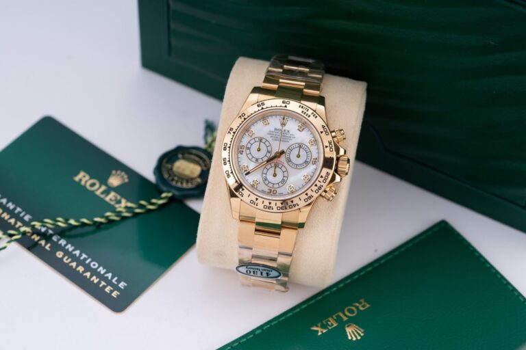
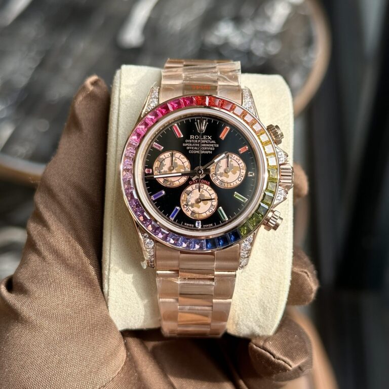
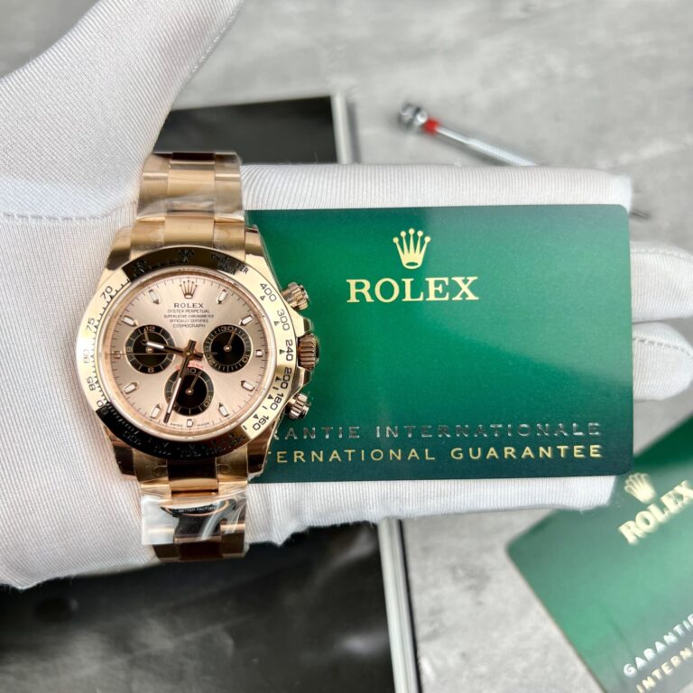
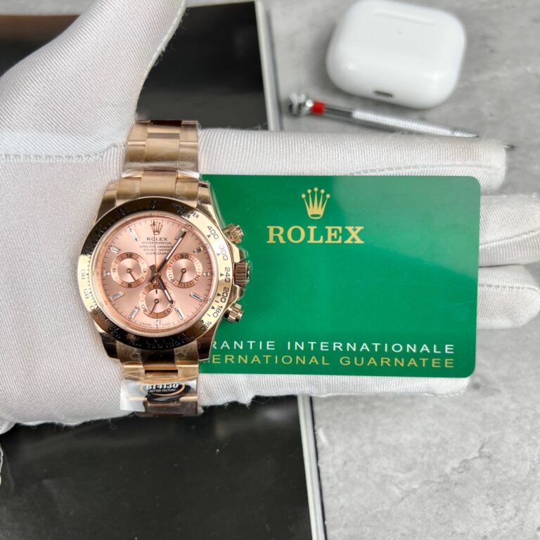
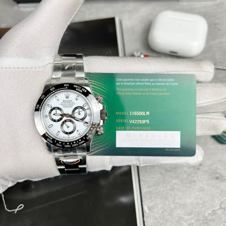
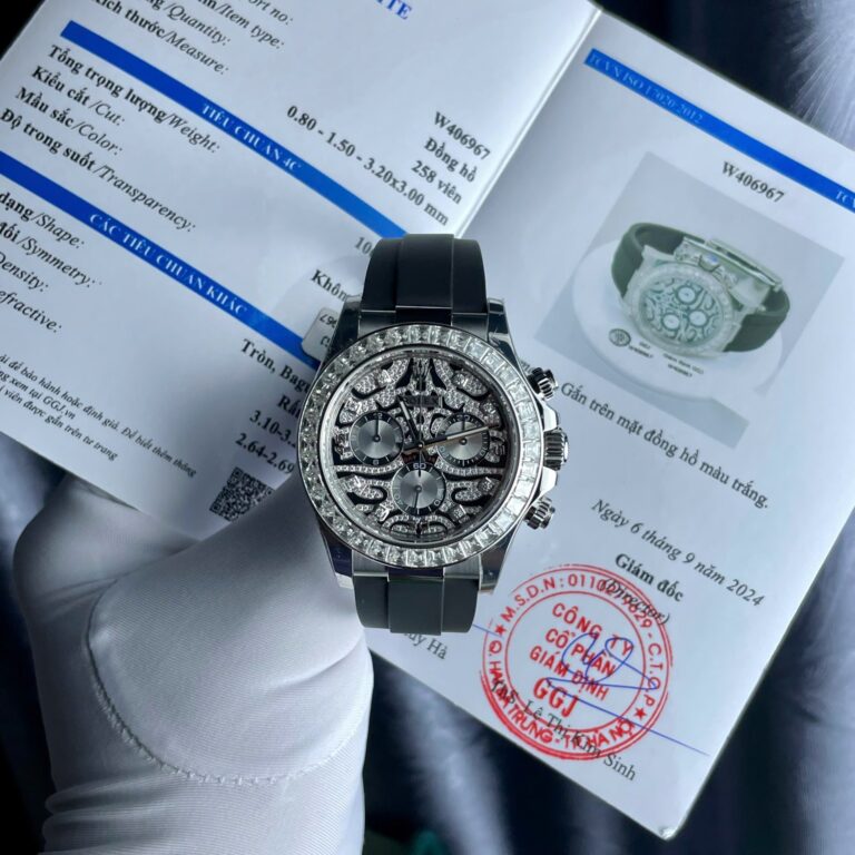
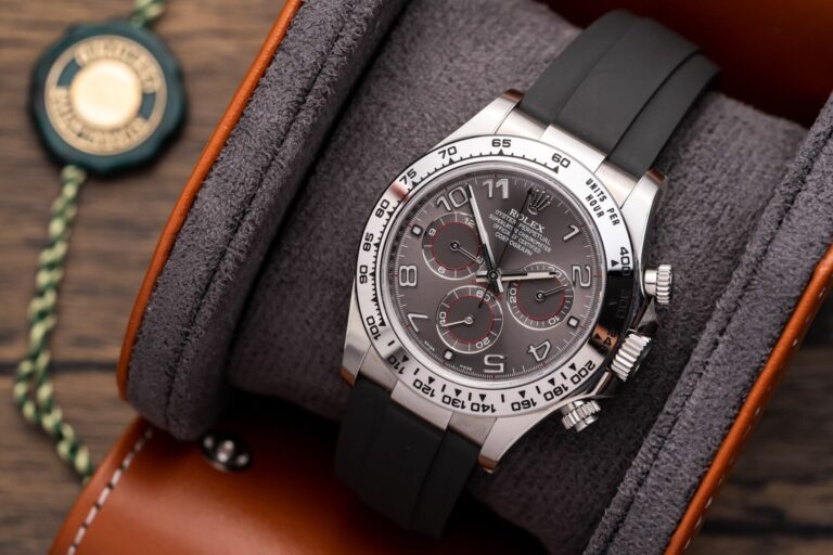
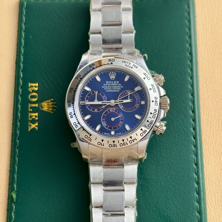
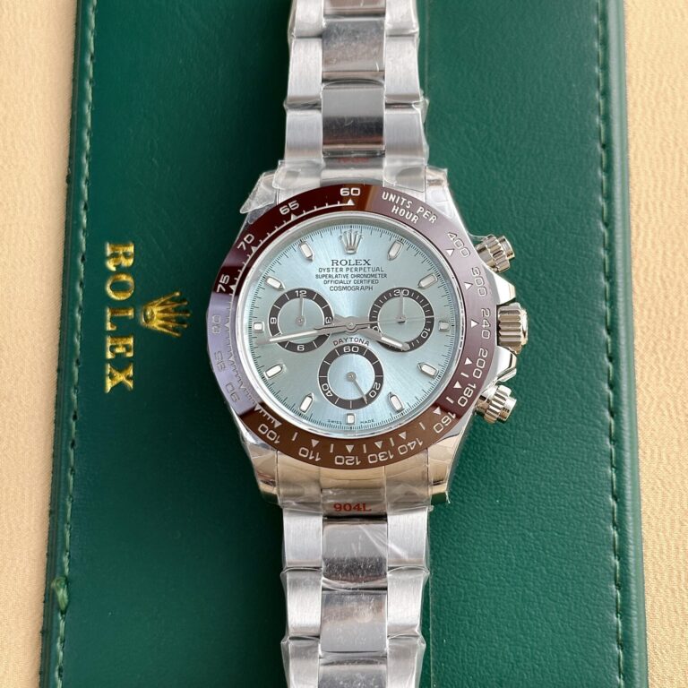
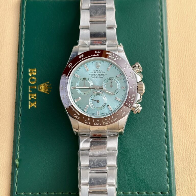
Rolex Daytona 116508 40mm SS (Clean Factory Super Clone) Mother Of Pearl Dial – Calibre 4130 Automatic
40 mm
Stainless Steel
RLX-116508-4381
Call: +1 (800) 729-2661
sales@replicawatchesco.com
Yes — this is the ReplicaWatchesCo.com Daytona version, not the SuperCloneReps page.
The Daytona looks simple until you compare several versions side by side. Its familiar parts are easy enough to name: three subdials, a tachymeter bezel, screw-down pushers, an Oyster-style bracelet, and a fairly compact case. The harder part is getting the spacing right.
That is where Rolex Daytona replica watches can separate quickly. A subdial sitting slightly too high, thick printing around the registers, a bezel that looks too heavy, or pushers sitting awkwardly against the case can change the whole face of the watch. Each part might look close on its own. Together, they can still miss the reference.
For ReplicaWatchesCo.com, the Daytona category makes more sense after you identify the generation and dial configuration. Movement and factory names come later. First decide which Daytona is actually being compared.
Not every modern Daytona uses the same case, dial, or movement layout. The 116500 generation and newer 126500 generation are close enough in casual photos to look interchangeable. Put the references beside each other, though, and the differences show up in the case shape, bezel treatment, dial details, and movement generation.
A good 116500 build should be judged against the 116500, not against details borrowed from a newer 126500. Mixing those generations makes factory comparisons messy fast.
A buyer looking for a black-dial 116500LN isn’t necessarily looking for the same watch as someone choosing a white-dial 126500LN. The overall idea stays familiar, but the small visual decisions change.
Reference first. Factory second.
The Daytona dial leaves very little empty space. Three subdials take up much of the center, applied markers sit around them, and the Rolex text and coronet occupy the upper half. The minute track and outer printing frame the rest.
With that much packed into one surface, proportion carries more weight than tiny typographic details.
Start with the distance between the subdials. Registers that sit too close together make the center look crowded. Registers set too far apart leave the dial strangely open.
Their diameter matters too. A slightly oversized subdial can crowd the surrounding markers, while a small one makes the center feel underfilled.
Macro photos help with this inspection, but they also create a bad habit. Buyers zoom in on a single letter or marker and miss the proportion problem visible from a normal viewing distance.
Step back first.
The dial should look balanced before you worry about individual printing.
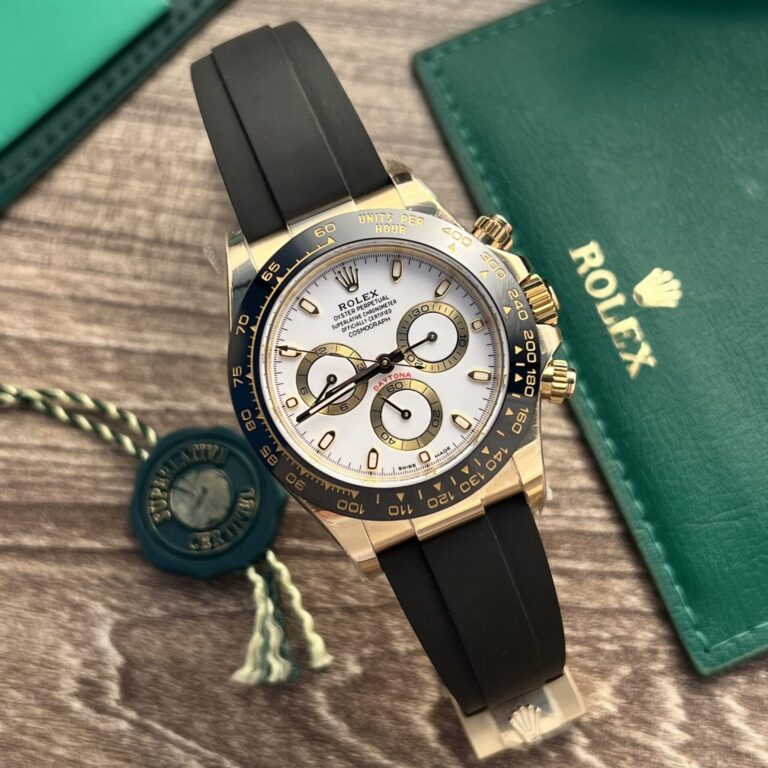
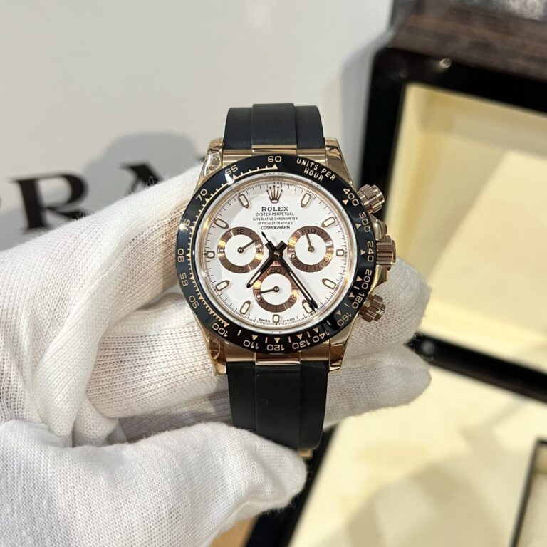
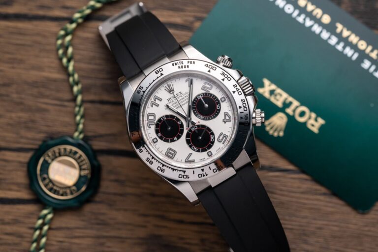
A white-dial Daytona puts contrast on display. Dark subdial rings, black text, polished markers, and the outer minute track all sit against a bright background, so misalignment has little room to hide.
Check the placement of the subdials and the gap between their black rings and the surrounding markers.
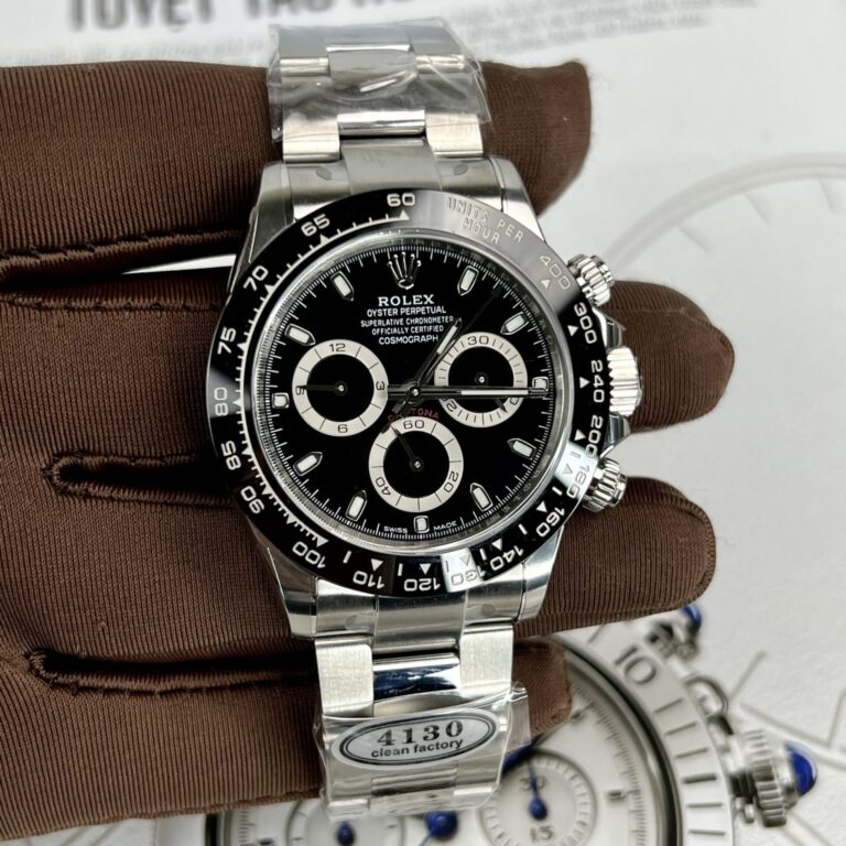
The black-dial version asks for a different inspection. Its subdials blend into the center more easily, leaving the polished hands and markers to carry most of the contrast.
Dust, thick printing, or rough finishing around the registers can disappear in a dark supplier photo. Look at how clearly the hands separate from the background, especially outside dramatic studio lighting.
One dial isn’t automatically easier to reproduce.
They expose mistakes in different places.
The tachymeter bezel is one of the Daytona’s easiest features to recognize and one of the easiest places for proportions to drift.
Begin with the engraving. Numerals should sit consistently around the ring instead of appearing too deep, too thick, or unevenly filled.
Then judge the bezel against the dial and case.
Does it look too wide?
Does it make the case appear heavier than it should?
Does its edge meet the case naturally, or does the ring look perched on top?
Those questions matter more than a single close-up of a clean numeral.
The 126500 generation also changed the way the bezel integrates visually with the case. A 126500 replica compared only with 116500 references may look wrong for reasons that have nothing to do with its engraving.
The bezel helps define the entire outline of a Daytona.
The Daytona isn’t a three-hand watch with extra circles printed on the dial.
The chronograph needs to start, stop, and reset correctly.
A still photograph can’t answer those questions.
The central chronograph seconds hand should start and stop cleanly, then return to its resting position after reset. The subdial counters should behave according to the movement inside the watch.
The pushers shouldn’t require excessive force or feel vague through their travel.
A few sensible operations tell you more than repeatedly hammering the mechanism.
There is no reason to keep activating the chronograph just because the buttons are there. Start it, stop it, reset it, and pay attention to what the hand and counters actually do.
Daytona pushers stand out because of their screw-down collars, which gives the right side of the case another set of proportions to judge.
Look at the pushers in relation to the crown. They shouldn’t appear oddly long or sit too far away from the case.
The collars should also look consistent rather than one projecting noticeably farther than the other.
The crown, guards, upper pusher, and lower pusher all occupy a tight area. When one piece is visibly oversized or misplaced, the entire side starts to look crowded.
It is a small detail, but the Daytona case leaves little room for a small detail to stay isolated.
The Daytona is commonly associated with a 40mm case, but the way it wears depends on more than the stated diameter.
Case shape, lug profile, thickness, and the relationship between the bezel and mid-case all change the impression of size.
A replica can list the correct diameter and still look bulky if its case sides or bezel are too heavy.
Straight-on photos hide much of that.
Side-profile images are more useful because they show how the case has actually been shaped.
Look from the crown side and then from the opposite side. You get a better sense of thickness, lug slope, and the transition from the mid-case to the bracelet than another perfectly centered dial image will provide.
Most Daytona comparisons stay focused on the dial, bezel, and movement.
The bracelet gets pushed down the list, even though the first links determine how the watch leaves the case. Poor end-link fit can make an otherwise convincing build look unfinished.
Check the gaps, then inspect the clasp.
The bracelet should look like it belongs to the case rather than something attached afterward.
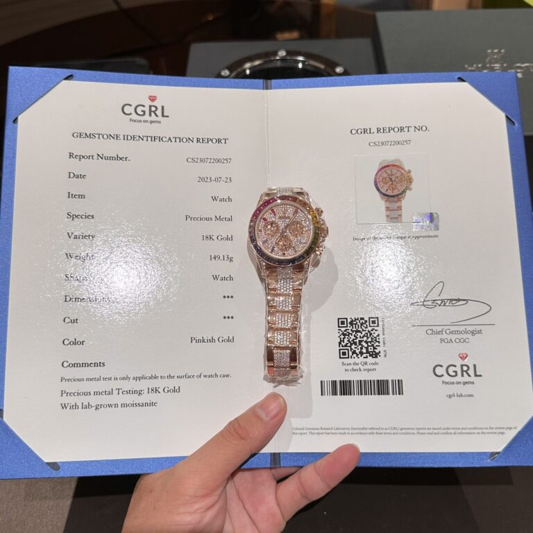
On gold-tone and two-tone versions, color deserves extra attention because so much metal is visible. Slight differences between the case, bezel surround, bracelet, and clasp can show under ordinary lighting.
Movement names dominate Daytona discussions because the chronograph depends on what sits inside the case.
Older 116500-style builds are commonly discussed around 4130-type clone movements, while newer 126500-style builds bring 4131-type movements into the conversation.
The larger number doesn’t automatically make one replica movement better.
These are different generations intended for different Daytona references.
The useful questions concern the actual watch:
Does the chronograph start, stop, and reset correctly?
How do the pushers feel?
What power reserve does that particular clone movement deliver?
Can it be serviced?
The movement name gets you into the comparison. It doesn’t tell you how that particular watch behaves.
A Daytona dial can look convincing while the chronograph is stopped.
Use the watch and the weak points become easier to find.
The subdials need to correspond to the movement architecture rather than merely fill the correct spaces on the dial.
Lower-end chronograph replicas have historically used different movement layouts while trying to imitate the Daytona display. The result may look acceptable in a product image and behave incorrectly once the buttons are pressed.
That is part of the reason buyers pay attention to factory and version numbers on higher-grade builds.
A better-looking movement has value.
A chronograph that starts, stops, and resets properly has more.
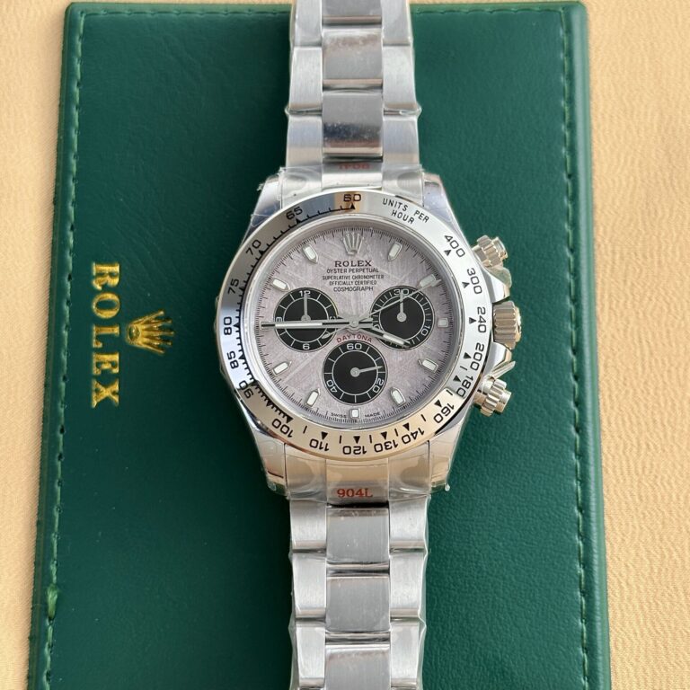
A steel Daytona on an Oyster-style bracelet presents one set of inspection points.
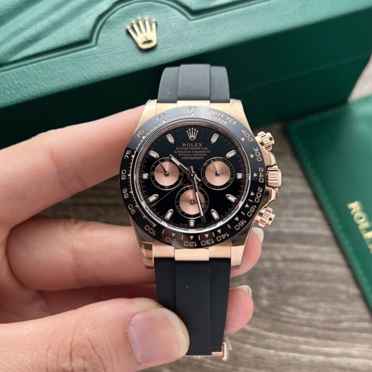
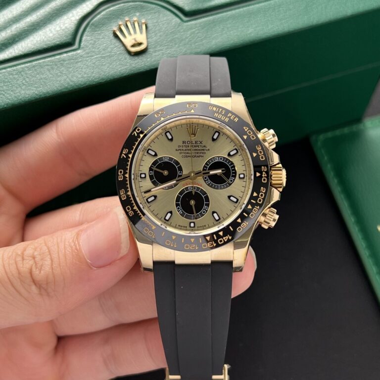
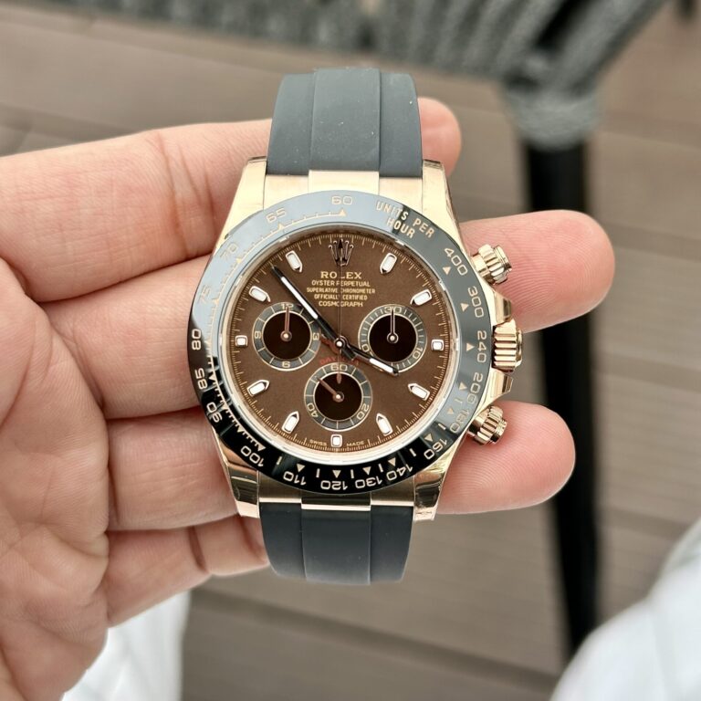
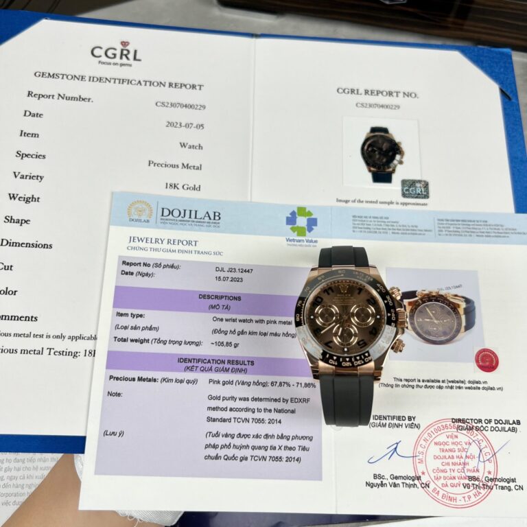
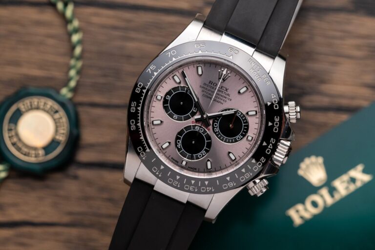
A gold-tone model on Oysterflex introduces another.
Case color becomes part of the comparison, as does the contrast between the dark rubber strap and the case.
Weighted gold-tone models add a question about mass and balance.
How heavy does the watch feel compared with the lighter steel version?
Does the weight sit naturally on the wrist, or does the case feel disconnected from the strap or bracelet?
For an Oysterflex-style Daytona, focus on how the strap meets the case.
On a full-bracelet version, end links and clasp deserve more attention.
A weighted build brings total mass into the discussion.
The name remains Daytona, but the inspection changes with the configuration.
Factory discussion is unavoidable with Rolex Daytona replica watches.
Clean, BTF, QF, APSF, and other factory names appear beside different versions and generations, and that information can be useful.
It only becomes useful after the reference is fixed.
Write down the exact setup first:
126500LN, black dial, steel bracelet.
Then compare the versions available for that configuration.
Look at the dial, bezel proportions, case profile, movement, and bracelet fit.
Once those details are tied to one reference, the factory label has something concrete to describe.
A factory that gets one Daytona reference right isn’t automatically the best choice for every Daytona configuration. The same name can appear beside watches that differ in generation, movement, and finish.
Begin with the complete dial, not a macro crop.
Are the three subdials spaced correctly?
Does the bezel look proportional to the case?
Do the markers and hands sit cleanly around the registers?
Move to the chronograph next.
Check start, stop, and reset.
Watch the central chronograph hand and pay attention to the pusher feel.
Then inspect the case profile and the bracelet connection, where an otherwise strong build can lose its shape.
For a newer-generation model, confirm that the replica is being compared with the correct reference rather than older Daytona photos.
One generation mismatch can make a good watch look wrong, or make an inaccurate one seem better than it is.
The Daytona gets easier to compare once the exact reference is fixed.
Start with:
Then compare versions within that exact combination.
A white-dial steel 116500 and a rose-gold-tone 126500 on Oysterflex are both Daytonas, but nearly every detail worth inspecting changes between them.
ReplicaWatchesCo.com carries Rolex Daytona replica watches across different generations, dial configurations, movements, bracelet and strap options, and factory versions.
Pick the reference first. The factory comparison makes sense after that.
| Movement | |
| Case Material | |
| Diameter | |
| Thickness | |
| Bezel | |
| Crystal | |
| Power Reserve | |
| Waterproof |
Browse our collection of 1:1 CNC-milled clone timepieces and select a watch for precision regulation.
Explore The Collection →